When most people think of important modern architecture in Ottawa, the buildings that typically come to mind are the National Gallery of Canada, the Canadian War Museum, the Canadian Museum of Nature, or the Canadian Museum of History across the river in Gatineau.
But there are other buildings that most of our citizens don’t know about that are also truly wonderful. They show that while Ottawa has become too lax when it comes to urban planning and building standards in recent years, there are examples of the profound impact that buildings can have when their federal and municipal leaders working with talented architects get it right.
All of the buildings featured below are mid- to late-20th century, except for the Holocaust Memorial, which was completed in 2017. They range from a private residence (albeit a diplomatic one) through important municipal and federal buildings to a monument. They cover a range of scales and typologies, but each one is exemplary in its category.
We encourage you to see as many of them for yourself as you can.
The Danish Ambassador’s Residence
(Left) The front entryway of the Danish Ambassador’s residence.
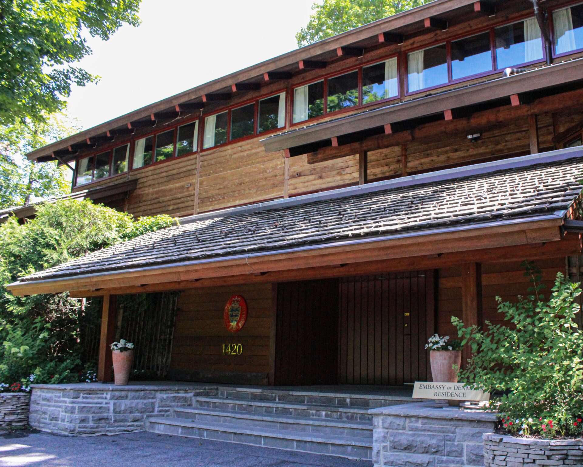
While this building is a private house, it also serves diplomatic functions. It’s an exquisite piece of architecture in which everything had been placed in the hands of the designers, Jarl Heger and Karen and Ebbe Clemmensen.
The main structure is made almost entirely of wood, and despite the fact that it’s the dwelling of a high-ranking diplomat, it has a real humility to it. If you think of the typical McMansion approach to home building that you see throughout the Rockcliffe neighbourhood, the Danish ambassador’s residence is so much more elegant and refined in comparison.
It’s also exquisitely crafted. It’s like a big wooden jewellery box or a complex piece of furniture, and it’s put together so well and speaks to the values of the nation it represents. In a way, the house is a kind of ambassador of the nation of Denmark itself.
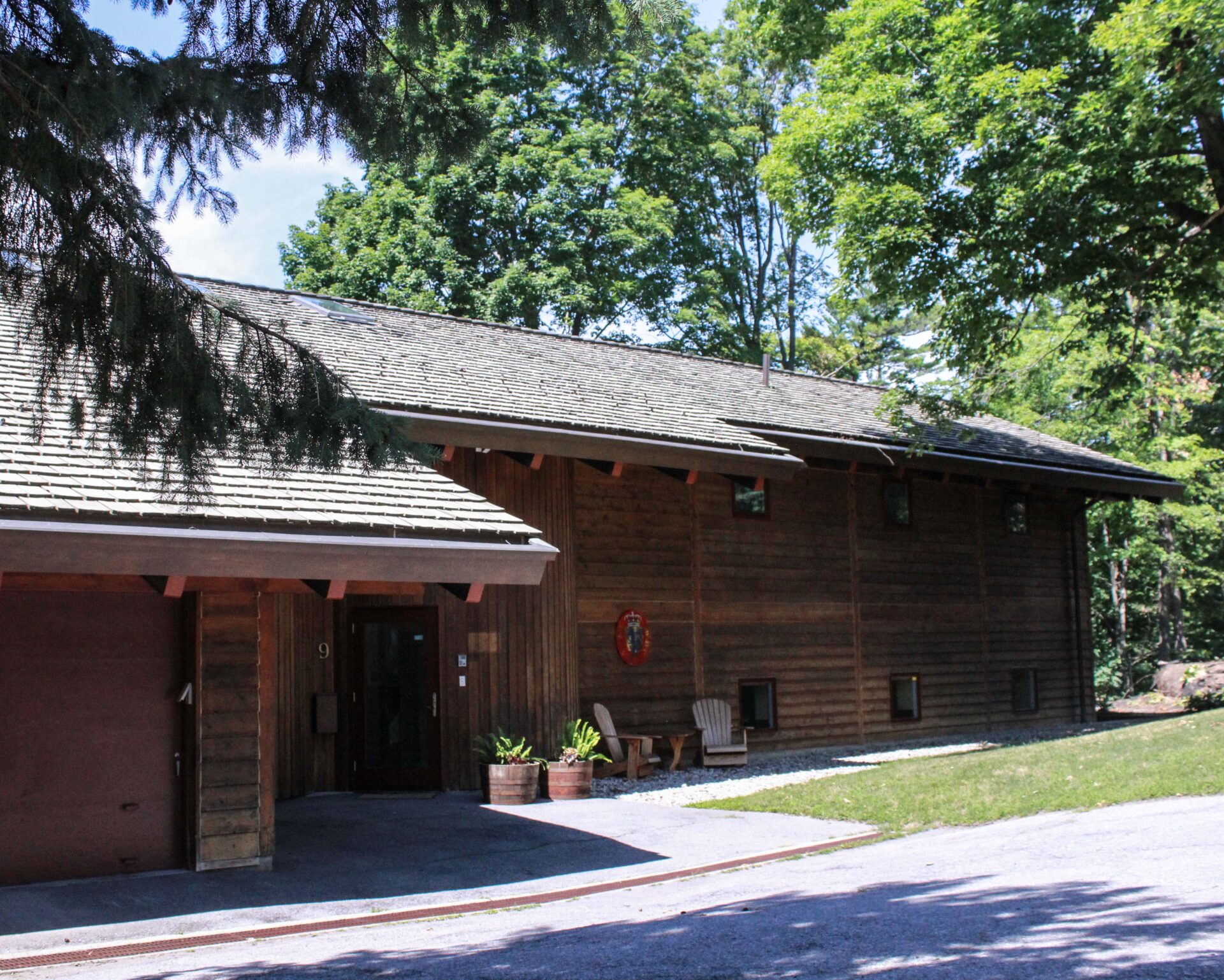
The building has two façades, one facing the Rockcliffe Parkway, and the other facing a smaller neighbourhood street. It’s the architectural equivalent of a good neighbour¹, knitting itself quietly and very respectfully into the fabric of the residential surroundings.
(Right) Nestled into mature greenery, the building fits right into the surrounding residential neighbourhood.
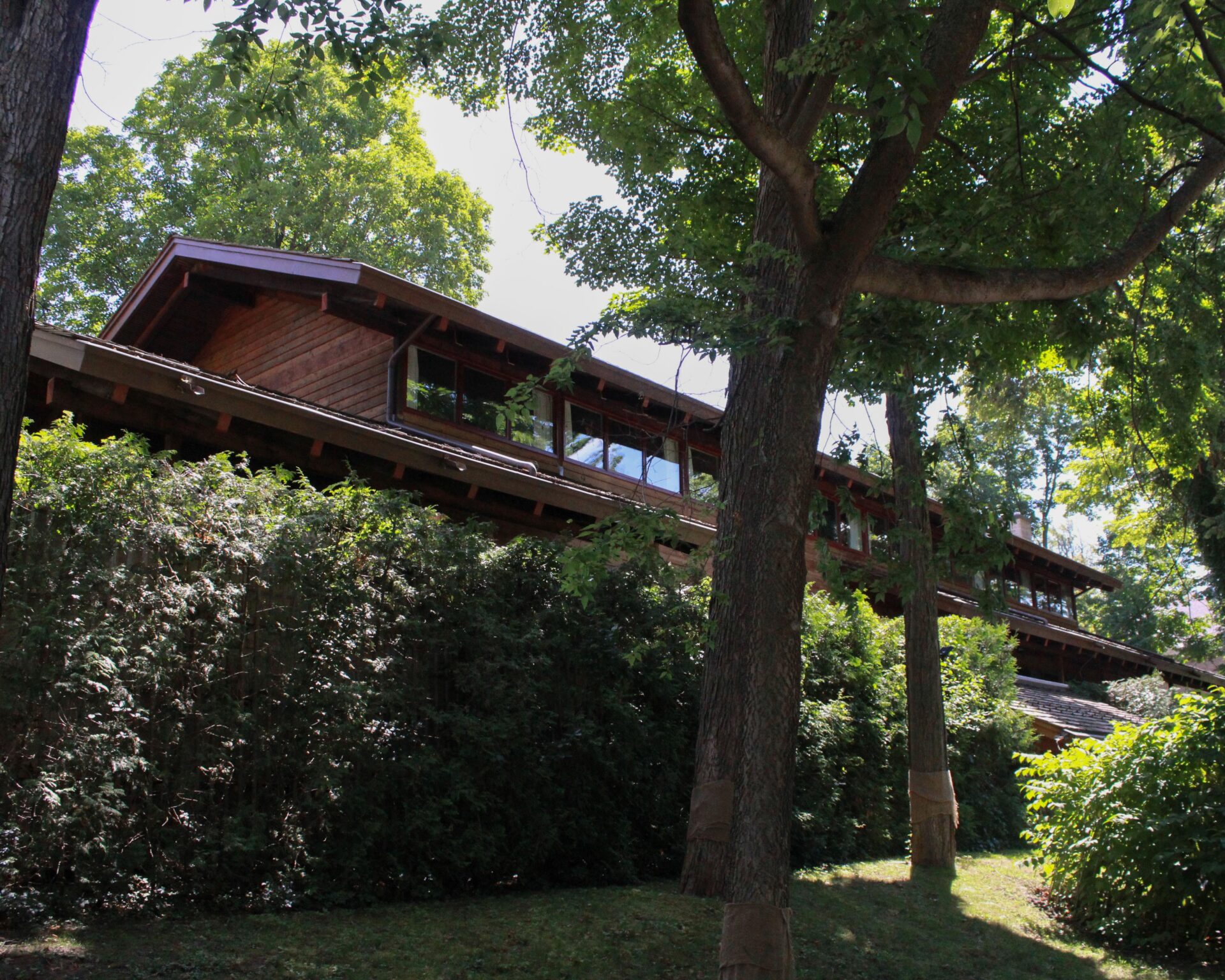
(Left) The rear of the building shows the same quality of materials and construction.
A Tale of Two Diplomatic Buildings
After World War II, there was a desire on the part of the Nordic countries to turn away from the International Style — an often-generic approach to large glass and steel buildings — and look inward to their own traditions and resources. In keeping with that philosophy, the building seems to be saying, “Yes, we are on the world stage and we are going to participate, but we will do so on our own terms”.
By way of contrast, consider the forbidding look of the Embassy of the United States of America, with its monumental scale, imposing materials and the bombastic central cupola at the top.
While these two diplomatic buildings couldn’t be more dissimilar in how they want to be understood, it should also be noted that they were completed at different times. This helps to shape the values they communicate. The Danish ambassador’s residence was completed in 1972, whereas the new US Embassy (designed by David Childs of Skidmore, Owings & Merrill) was completed in 1999².
In this video, Danish Ambassador Hanna Fugl Eskjær takes you on a tour of the residence. You may be able to view the building in person during the next Doors Open Ottawa.
Old City Hall
(Right) Front view of Ottawa’s former city hall building, showing the sheltered entry and the transparent lower levels. Note the stonework on the front projection (which houses the meeting areas).
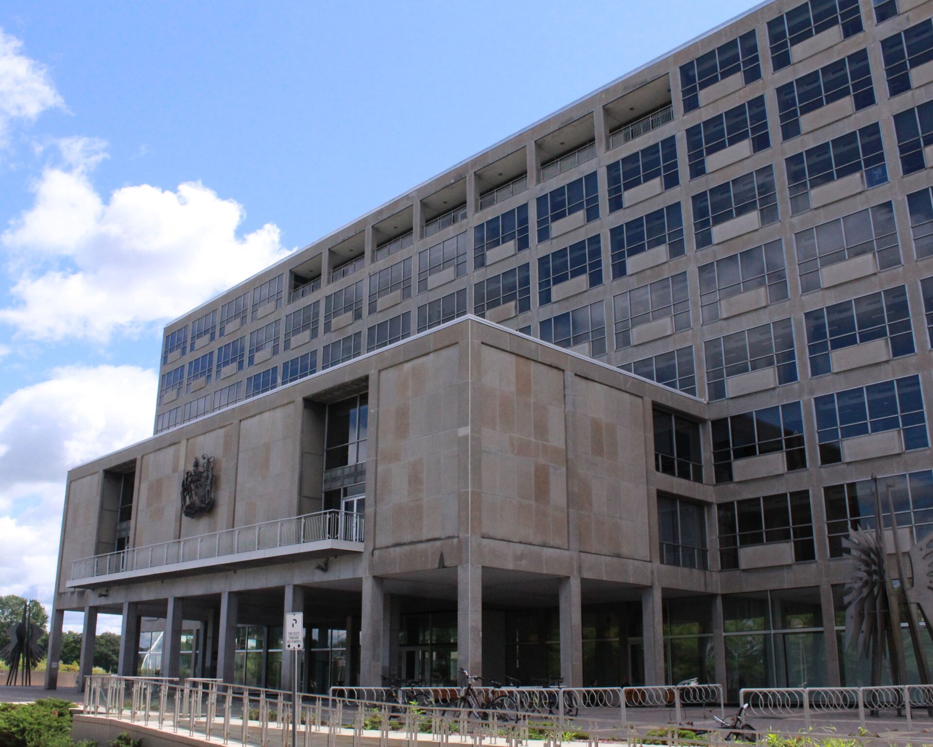
Now known officially as the John G. Diefenbaker Building, the former city hall is located at 111 Sussex Drive.
The original building, designed by Murray and Murray, served as Ottawa’s city hall from 1958–2000. Moshe Safdie, who also designed the National Gallery of Canada, designed the additions that were completed in 1994.
The additions, consisting most notably of conical and pyramidal forms, a curved entryway and office spaces, and a white steel box-shaped truss tower, are unfortunately a rare and unsuccessful rhetorical gesture for Safdie. They seem to be trying way too hard to be noticed.
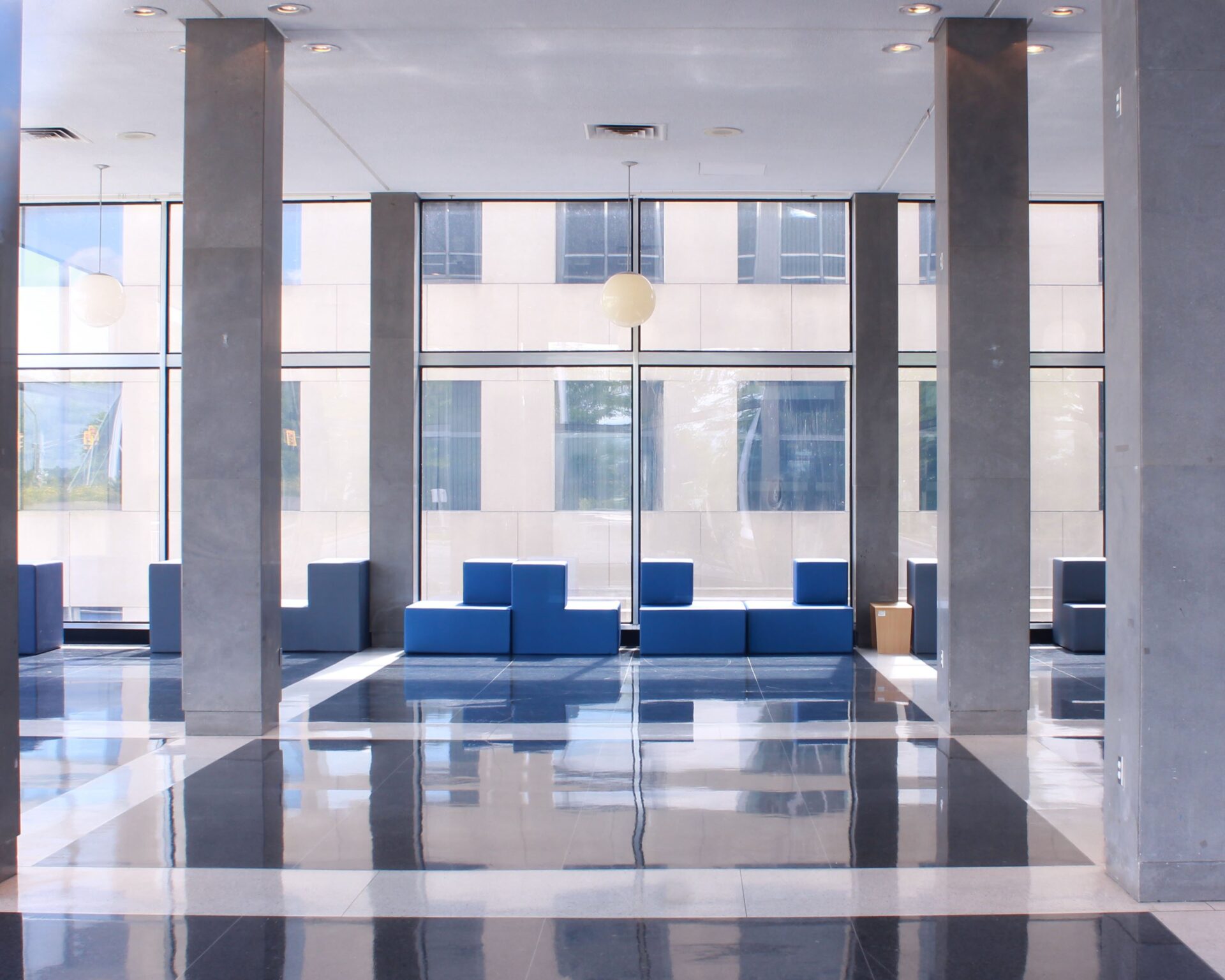
(Left) From the outside of the building, you can see right in, which is a perfect metaphor for the democratic ideal of transparent government.
A Place for the People
On the other hand, the Old City Hall is supremely elegant and was built using gorgeous materials that have really withstood the test of time. Not only does the building have real dignity, it brings dignity to viewers when they stand on the elevated plaza.
From the outside of the building, you can see right through the first two elevated stories of the giant glass entry. Not only does this look like a great place to hold municipal receptions, the fact that the whole lobby is made of glass communicates that government is (or at least should be) transparent, and that people are welcome. Walking through the lower level leads you to a beautiful little garden in the back, and the interior of the building harmonises with the formal landscape.
The front has a smaller box-like projection that serves as a public meeting room and that creates a shield over the entryway. This is an important symbolic welcoming gesture saying that the interaction with the citizens comes first.
Inside, the monumental staircase is a gorgeous way of lifting people up to the second level public meeting room. Effectively, the building welcomes people in and carries them up to where they can meet with the mayor and city councillors.
The Old City Hall is an example of how successful the International Style can be, with its glass and steel that proudly showcases the strength and thinness of these relatively new industrial materials. But the building also has some very high-end stone cladding, and doesn’t come across as a generic glass-box office tower because it has so much more detail.
You can view photographs of the building taken in 1958 on the Government of Canada website.
Library and Archives Canada
(Right) Library and Archives Canada: a view of the front of the building, showing the side wings and the central block, which houses the artifacts collection.
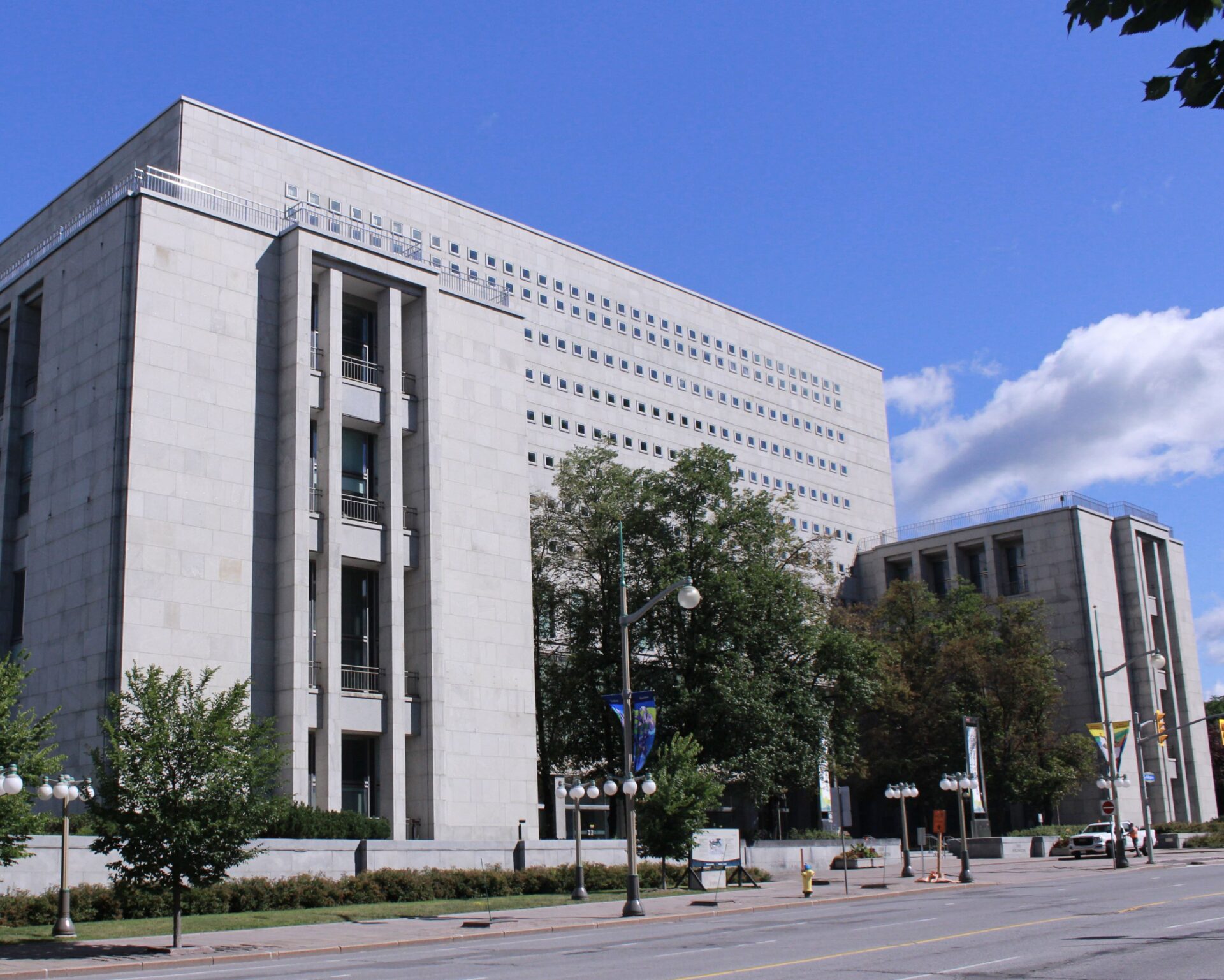
This building is probably one that many people love to hate, given that the most visible part is a box that houses the manuscript vault, and has seemingly too-small windows. But if you think about how the space was designed to house documents and artefacts that are temperature, humidity and light-sensitive, it makes sense. It really is a federal monument to our heritage and to Canadian values at the time when it was built.
While the Archives is in the same architectural family as the Old City Hall, instead of being in the International Style it’s more like a modernised version of a Neoclassical building. It has the proportions and symmetry of a Neoclassical building, but it doesn’t have the trappings of ornamentation like columns and other flourishes.
(Left) Library and Archives Canada: detail of the west wing, which contains areas open to the public. Note the balcony at the top.
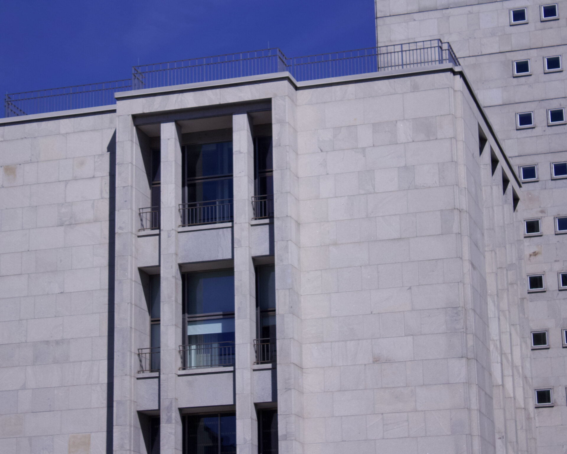
If you look at the shapes of the Archive, you see the two lower boxes on the sides and to the front, with a larger box in the middle. The two wings on each side are public areas like the reading rooms, and these areas have large windows and balconies (quite unlike any typical government or office building).
The central volume, however, contains the vault. The upper floors of the building have very small windows to make it safer for the archived materials, and these windows help communicate that it’s not a public destination (at least, the public can’t enter without an appointment).
Celebrating Precious Resources
One of the most delightful aspects of the building is that it looks like two hands holding up a precious treasure, which in fact is exactly what our national archived materials are. It’s a beautiful gesture to see: the building appears to be raising the central storage area up to the sky.
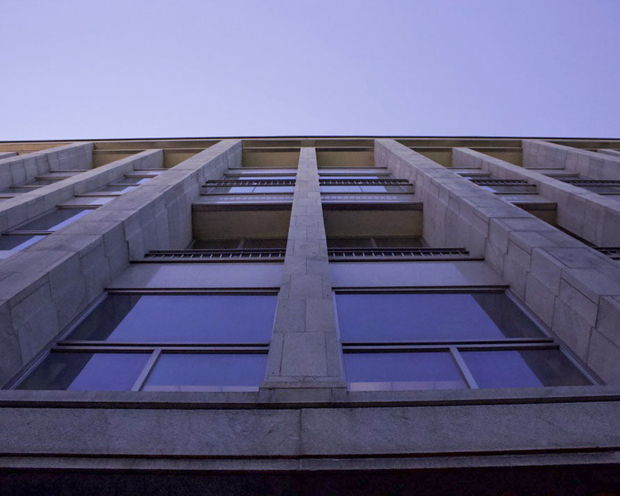
Like the Old City Hall, the Archive was designed so that you can see all the way through to the Ottawa River when you walk into the ground floor building. (Recent renovations may have reduced that capacity.) If you want to go to the river, there’s a gorgeous esplanade and staircase that takes you there. Because of this, you can think of the Archive building as a kind of connection point between Wellington Street and the river, or a bridge from the urban to the natural world.
Also in the entryway is a sunken meeting and reception area, and in the distance you would see the river, so it has a very public character on the lower levels.
When you walk into the Archive, the inside is clad in a gold mosaic, which gives you the feeling of having a religious experience, as though you’ve entered a place of worship. The outside uses stainless steel and travertine; these days it’s very rare to have rich materials like this used on a public building. These days we value engineering and economics, but the use of good materials on the surfaces helps explain why this building looks so good even though it was built in 1967.
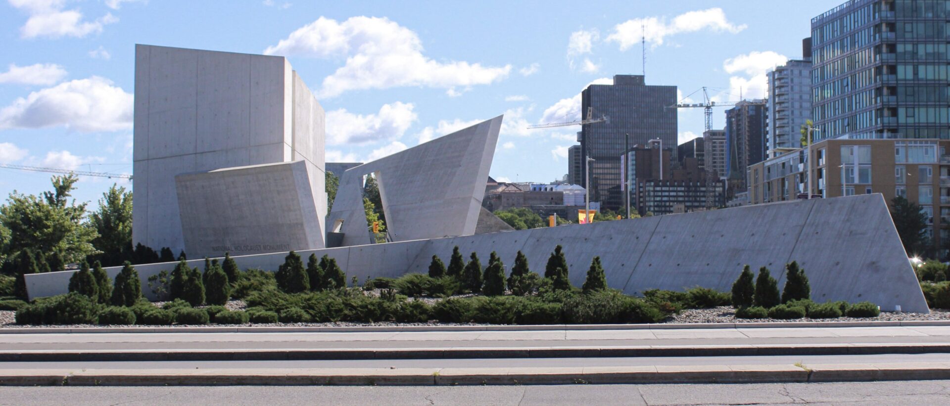
(Left) Approaching the Holocaust Memorial at the intersection of Booth and Wellington.
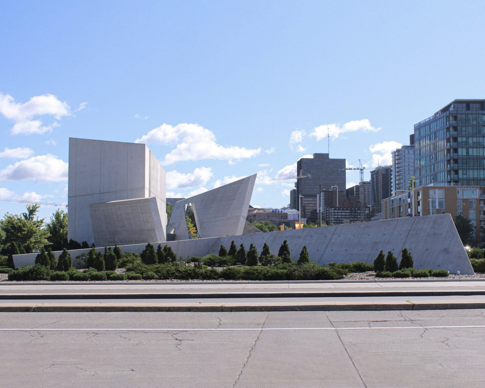
The architect who won the competition for this monument, Daniel Libeskind, was also the architect for the Jewish Museum Berlin. Both are built in the Deconstructivist style, which is characterised by angular shapes and seemingly disjointed planes that appear to be in conflict with each other.
The monument is located a short walk from the War Museum at the intersection of Booth Street and Wellington, and it’s been dexterously worked into the landscape. When it was built, evergreen saplings were planted that have now started to mature and become a critical part of its processional experience.
Terror and Resilience
As you move through the sequence of spaces of this memorial, you are confronted with a series of panels with photographs by Edward Burtynsky, and it echoes the experience of the Jewish and other prisoners as they were taken on trains through the forest. The trees help you feel as though you are experiencing the terrifying journey yourself as you walk through the memorial.
(Right) Maturing greenery and Burtynsky’s photographs of the railroad tracks in the forest echo the journey of Jewish prisoners to the concentration camps.
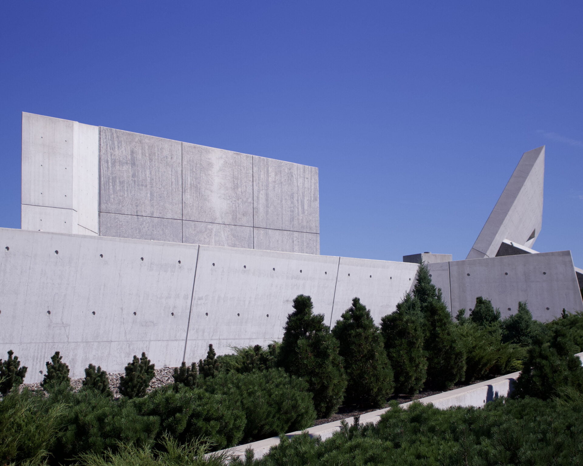
(Left) A closer look at the railroad tracks in the forest engraved in the building material.
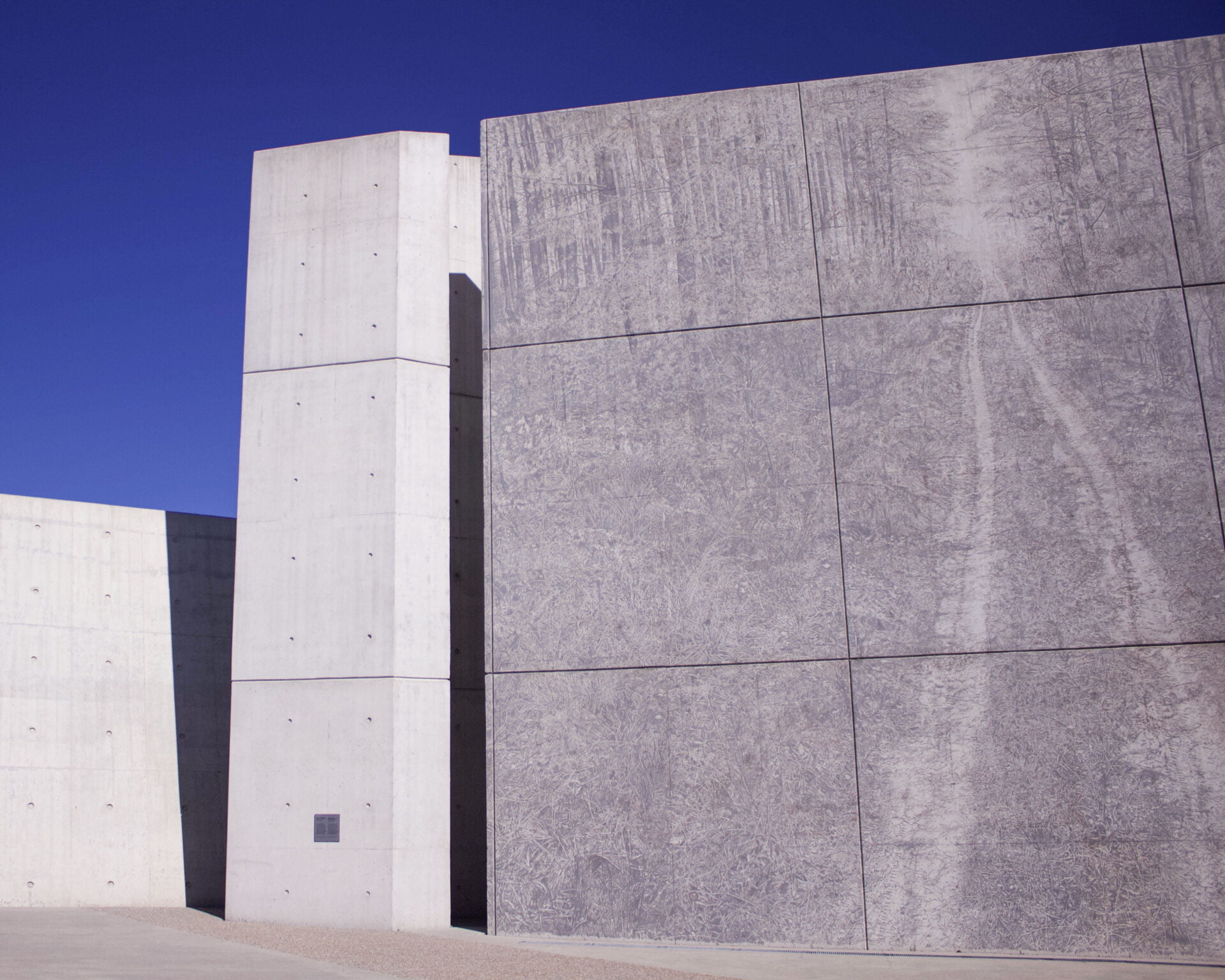
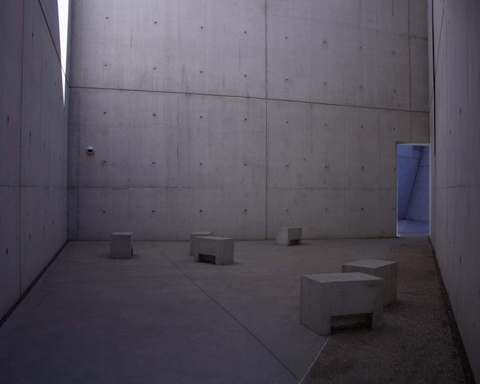
The eccentric geometries create a real spatial tension, because you can’t quite see where you’re going, and there are moments where space is constricted, and then it opens up to a much more generous public place in the centre for commemorative gatherings. In some spaces you feel alone, reflecting the experience of the targets of the Nazi genocide program. But there are also places where you feel relief as you reconnect to the community.
The monument is made almost entirely of poured-in-place concrete, which is a humble material. It’s used in such an exquisite manner, however, and to such a level of detail³ that the simple concrete becomes ennobled. This is similar to how careful construction ennobles the wood in the Danish ambassador’s residence and the glass and steel of the Old City Hall.
A Call for More Transformative Architectural Works
While Ottawa isn’t known as one of the world’s most architecturally enchanting cities, we do have some shining examples. We can be saddened by their rarity, or we can take them as beacons that light the way to a more people-friendly and more environmentally-friendly city in the future.
Footnotes
- This willingness to be a good neighbour is a perspective that’s more than skin deep, as exemplified by the “Whisky War”, a now-resolved border dispute over Hans Island between Canada and Denmark. While it was a serious conflict, it was very peaceful and even humourous at times.
- For context, the US Embassy was completed in the aftermath of the first bombing of the World Trade Centre in 1993, the 1995 bombing of the Alfred P. Murrah Federal Building in Oklahoma City, and of the 1998 embassy bombings in Kenya and Tanzania. For additional thoughts on the challenges of balancing functions of American embassies, there’s an article called “The Identity Crisis of the American Embassy” in the June 2000 edition of the Foreign Service Journal. It also includes some statements about the US Embassy in Ottawa by David Childs, who later designed the One World Trade Centre in New York City.
- An example of the kind of astounding detail to be found at the monument is that every fastener for the concrete formwork was carefully thought through and positioned. The imprints of these fasteners can be seen in the surface of the concrete.

