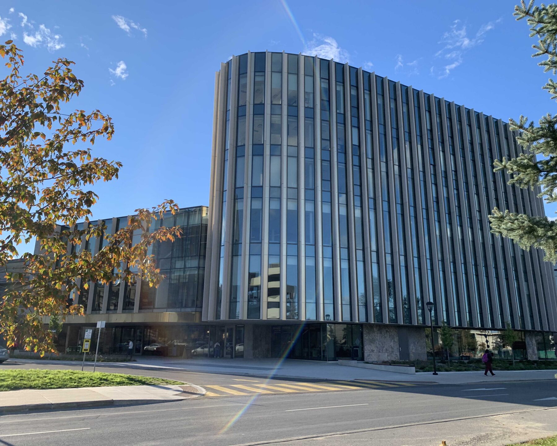
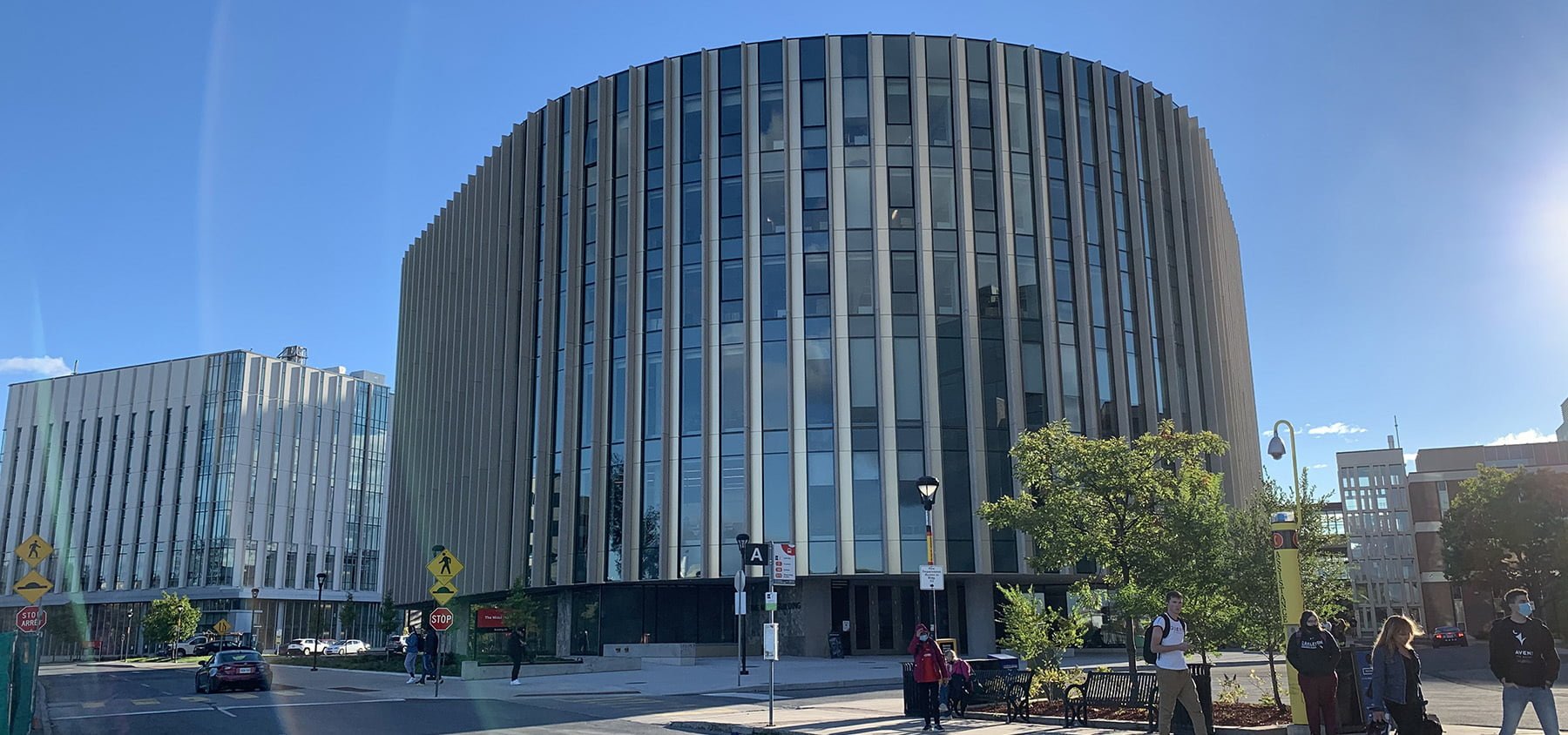
In all sincerity, I was not thinking I’d like the new Nicol Building at all. But the new facility for the Sprott School of Business is a very welcome addition to Carleton’s campus.
To this architect, almost every other newer building on the campus has almost no rationale for how it is placed in relation to other buildings.
It’s ironic that Carleton has a school of architecture with a very good reputation yet the campus itself seems to lack cohesive planning. It’s not a very pleasant experience to get from one place to another, and it can be very confusing and sometimes dangerous to pedestrians and to people working after dark.
Sprott’s new home, however, was actually designed to engender a welcoming public quad at its doorstep.
A Better Place to Learn
Designed by the award-winning Toronto office of Hariri Pontarini, the new building provides an excellent aesthetic and practical experience both on the exterior and the interior.
The building’s footprint inserts itself with great finesse into what was formerly a forbidding service and garbage collection area. It crafts an elegant, expansive, sinuous facade enclosing a gracious interior lobby/café/study lounge with 270 degrees of light and views (which will be lovely once the current parking lot is replaced by a green quad).
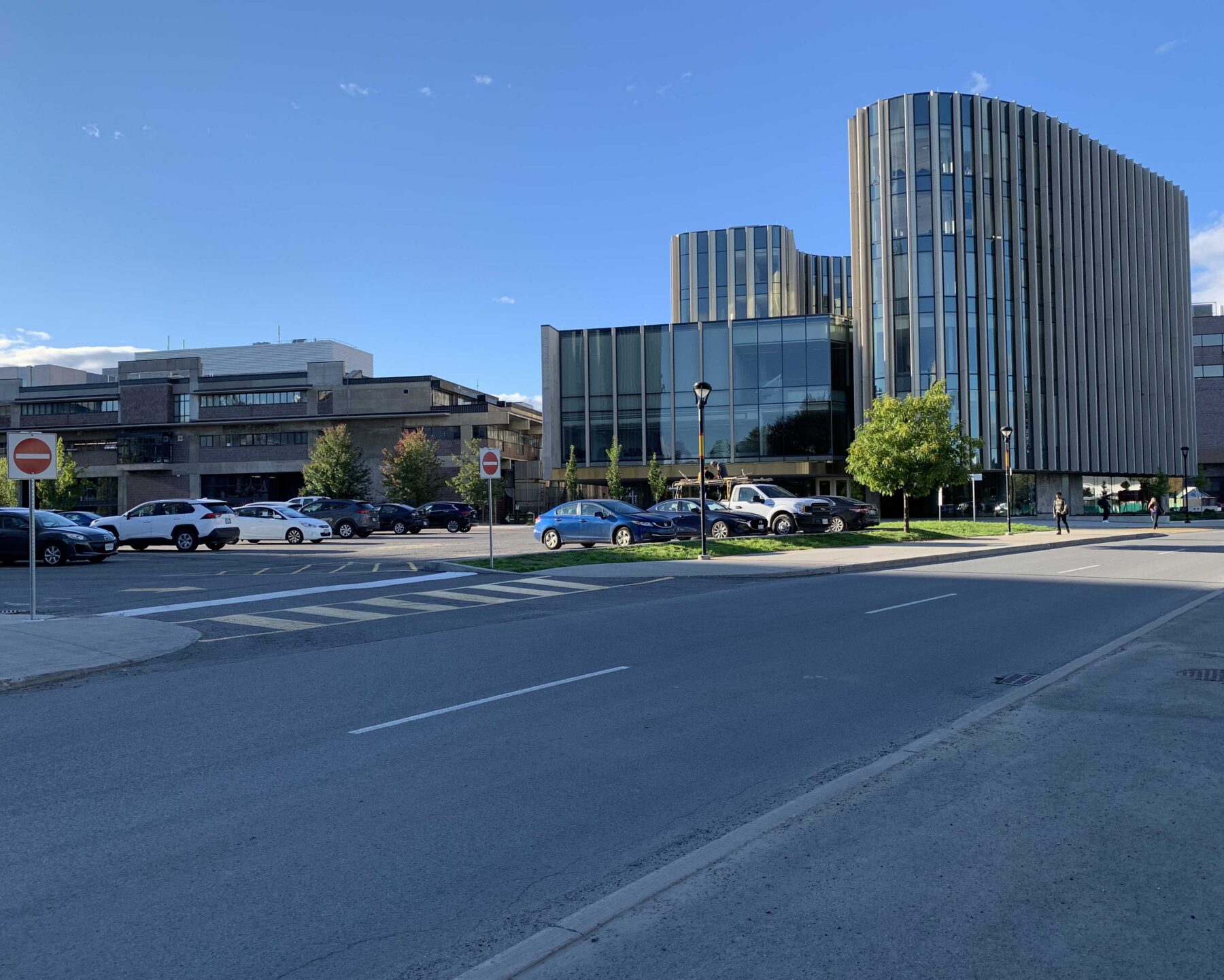
The building makes a much more elegant impression, considering that it is one of the first buildings that many people see when entering the campus. The overhang provides shelter for people entering the building, bicycle storage, and for people waiting for buses. It is also very clear where to enter the building without the necessity for signage — not a claim that most of Carleton’s buildings can make. The Unicentre Building, in particular, is infamous for its lack of spatial logic.
It’s also apparent that the architect stepped down the height of the box-like wing of the Nicol building to provide a harmonious visual transition to the architecture building next door.
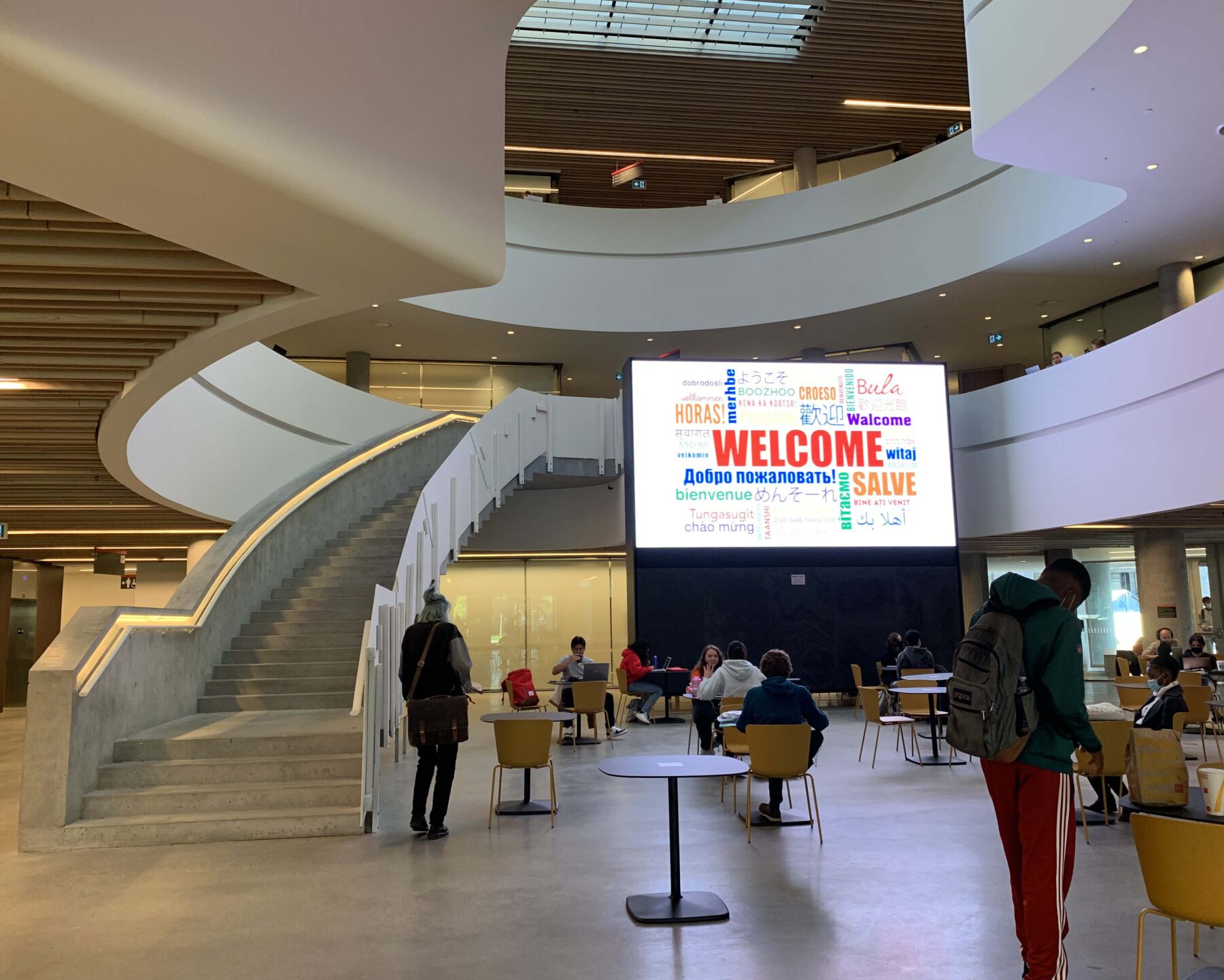
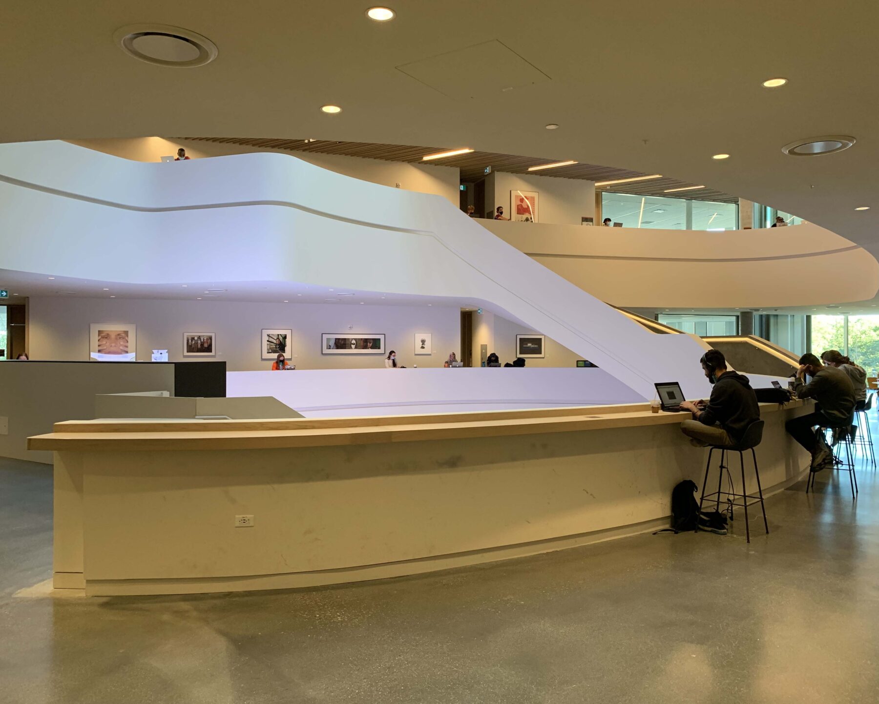
The interior features an enormous, spiraling stair that creates a study ledge on each floor. Even though the interior construction has not been completed, it’s already a go-to place for students (and not just business school students are being drawn here).
While this is not the time to write an extensive critique of the planning of the building, the combination of the curving interior and the rounded interior stair hall result in some odd-shaped chunks of unusable interior space. More importantly, however, the building is sculpted in a way that provides every primary space and office with natural light.
It’s unfortunate that drywall was chosen as a finishing material around the stairwell study areas. Drywall will not stand up to ongoing exposure to slushy winter boots, and will soon need replacement, which will of course be an added cost. This choice of material was probably not made by the architect, however, and was likely a construction cost-cutting decision.
These critiques, however, are not meant to take away from the overall design success of the building.
To My Faculty of Architecture Colleagues: Get Over It
The only potential downside to the placement of the building is that the adjacent school of architecture has now lost much of its southern sunlight. And yes, most of my fellow architecture faculty feel outraged over the loss.
I feel I must say to my colleagues: get over it. While we were looking out from our facade, the rest of campus was looking at our facade, festooned as it is with enormous mechanical ducts and garbage collection area.
It’s also important to remember that times have changed in our profession. Back when we were drawing plans on paper, natural light would have been essential to our work — but now we create on computer screens.
Carleton’s Campus Needs Better Planning
Carleton’s campus plan is fundamentally managed not by a campus architect, but by the office of facility management and planning (FMP).
It’s the only university that I know of in Canada and the US that does not have a full-time architectural professional overseeing campus planning. As FMP states on their website, they oversee everything from snow and garbage removal to new construction.
That the responsibility for architecture and landscape planning is lumped together with trash removal kind of explains things regarding the state of the campus.
While Carleton does have a master plan for the campus, the actuality seems to contravene it in many cases. The plan talks about leveraging the site’s situation between the canal and the river, but none of the buildings look towards these natural advantages. If you travel along Colonel By Drive, you get a lovely view of more garbage and recycling containers.
It’s sad that the Carleton’s board don’t see these blights as a form of negative publicity when many prospective students and their parents come to view the campus before making their decision about which university to attend. This is especially more important now, when COVID-19 has made it essential to give students a reason to fight through a commute to attend a lecture in person when there are options to view them at home.
We also can’t forget that for many faculties, lab work and group projects will never go away, and students and educators will need spaces in which to carry out this work. For a team of graduate engineering or architecture students working on a physical project that may be quite large, working at home just doesn’t cut it.
Many students simply find that a change of setting helps them enter a personal headspace that may not be easy to achieve at home. Others are drawn to a campus whose architecture fosters a meditative environment as well as proffers real, physical social spaces for spontaneous in-person interchanges that often wouldn’t otherwise happen.
Positive Examples from Other Campuses
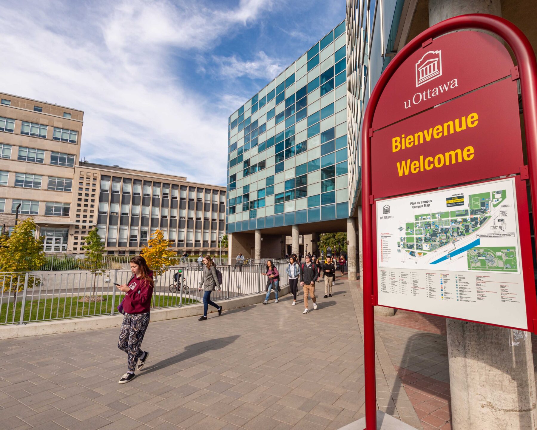
There are many examples of how well a campus can come together when it’s managed by a master architect, including the University of Ottawa.
The University of Ottawa’s campus is sensibly laid out, has beautiful promenades, and a lot of greenery that not only provides a beautiful aesthetic experience, it is functional. For example, there are places where a wall of greenery separates pedestrians from car traffic. The greenery also encourages walking across the campus, and therefore less reliance on cars which increase congestion (especially during rush hour) and carbon dioxide emissions.
The quality of the street furniture is also very high and was clearly chosen for durability, and the campus as a whole is beautifully maintained and landscaped. In other words, it’s a destination.
Unfortunately, what Carleton calls “landscape” is too often a neglected dead zone between buildings, and little thought is put into the siting and long term care of trees and other plants. Carleton’s street furniture, as well as finishings like railings on outdoor stairways, are dilapidated and in some cases unsafe-looking.
Conclusion
The Azrieli School of Architecture at Carleton has a wonderful international reputation; it’s what drew me to move here from the US to teach.
The lack of logical campus planning, however, casts a negative light on the school’s reputation, and on the reputation of the university as a whole. Creating a full-time, long term architectural planning office will help improve the campus experience and the prospects for the university as a whole.
Here’s hoping that additional buildings arriving on campus will be as smart as the Nicol for achieving a higher-quality campus setting.
