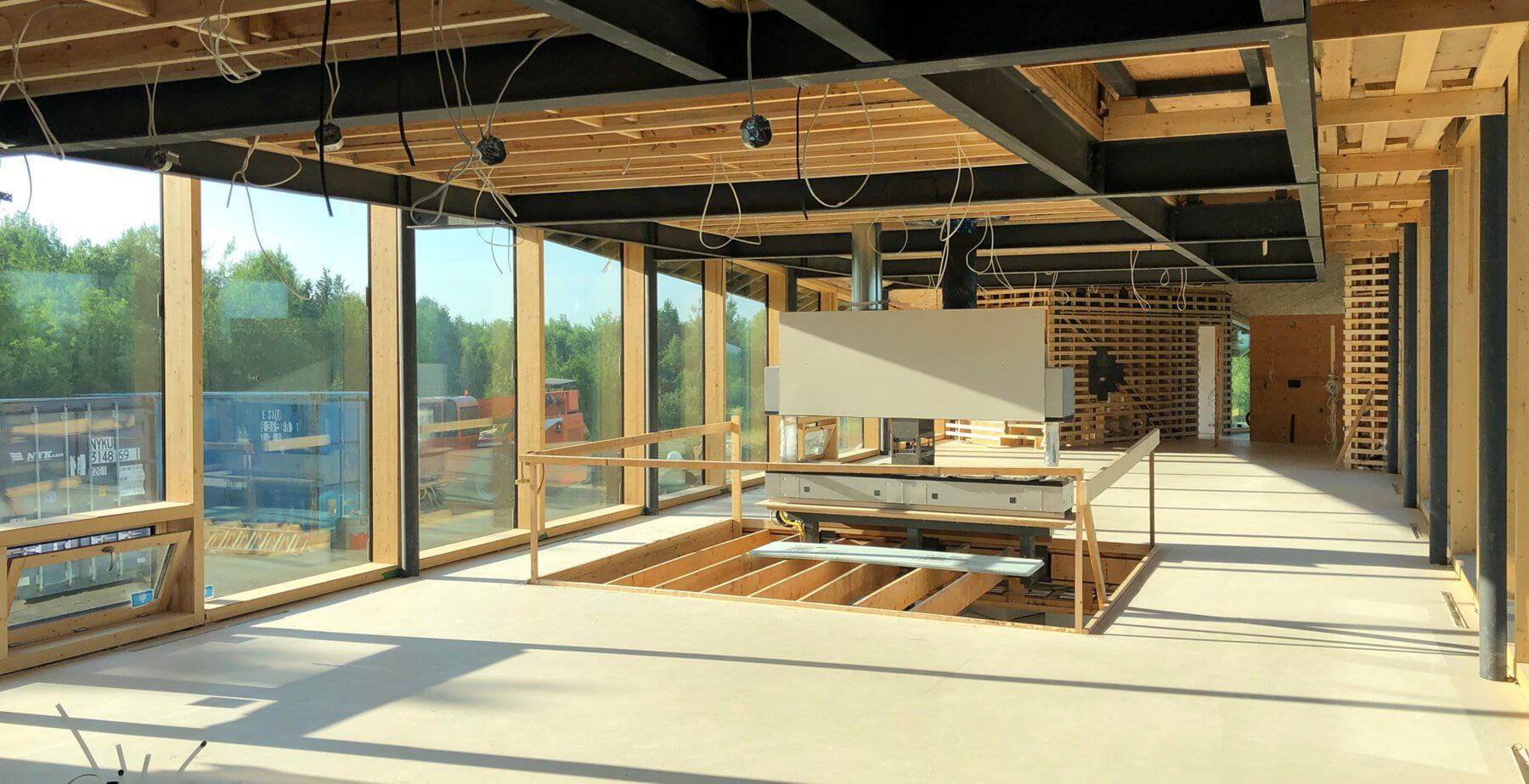
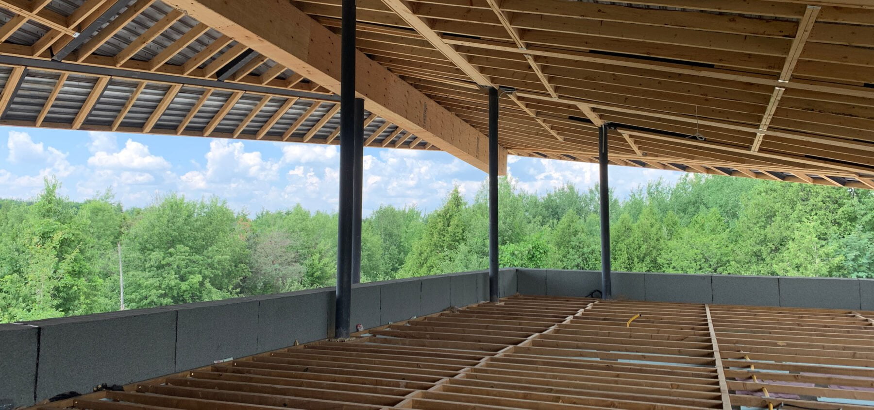
We’re thrilled to be heading into the final stages of construction on our Forest Retreat home in Caledon, just outside of Toronto. This is a project that began when our clients, who were eager to have their young children grow up surrounded by nature, jumped at the chance to acquire 100 acres of protected forest land when it came up for sale. The family should be moved into their finished home by October.
The creation of this 800-square-metre (excluding terraces and garage) home has been a fantastic journey for all of us involved, in part because its remote location opened up so many design directions that wouldn’t be possible on urban and suburban sites, where possibilities are constrained by zoning restrictions and pragmatics like size and privacy
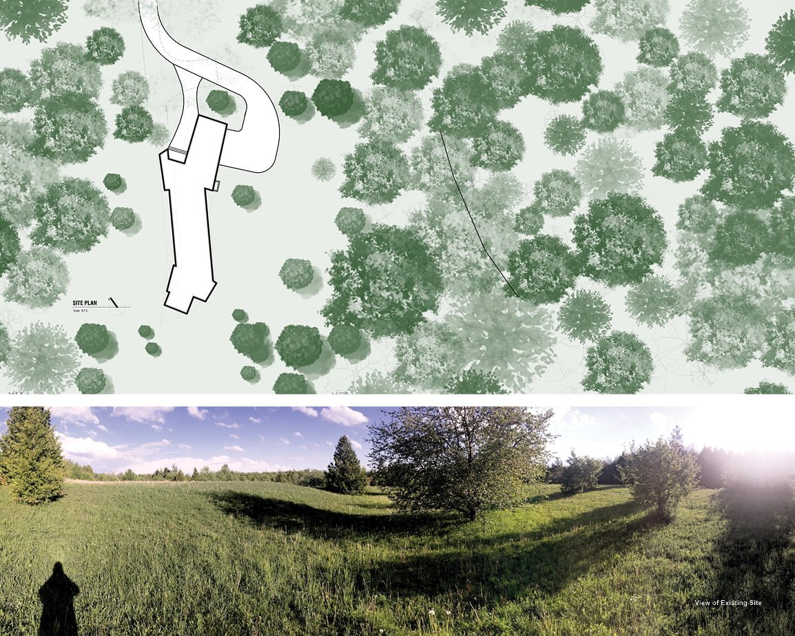
While our clients wanted a fairly large home, they also wanted it to be an absolutely casual, comfortable space for the family and their pets—no fancy entertaining or impressing the (distant) neighbours here.
The house is a large, continuous vessel of space with only the bedrooms and bathrooms closed off as individual rooms—a layout that underscores the closeness of the family.
The most powerful aspect of the design is the long, undulating, tent-like roof, which roughly follows the topography and describes the continuous space inside. Where typically it’s the walls of a home that are the scene-stealers, here the roof became the design’s primary focus.
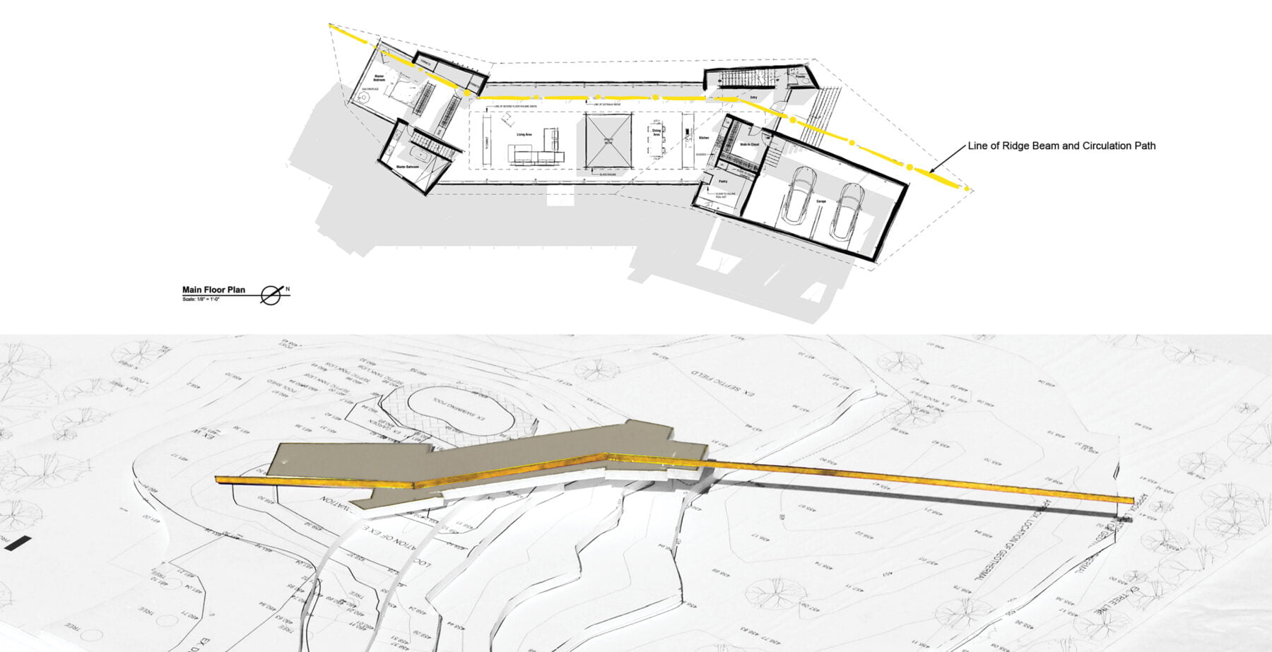
As with all our projects, we began concept development using physical study models. Where urban and suburban sites are often absent notable natural features, the gently rolling folds of meadow surrounding the site offered inspiration here. The yellow line on an early site model shows the home’s structural ridge beam, which also mirrors the entry approach toward the narrow side of the home, the circulation path through the home’s continuous interior, and the extension of the view toward the forest.
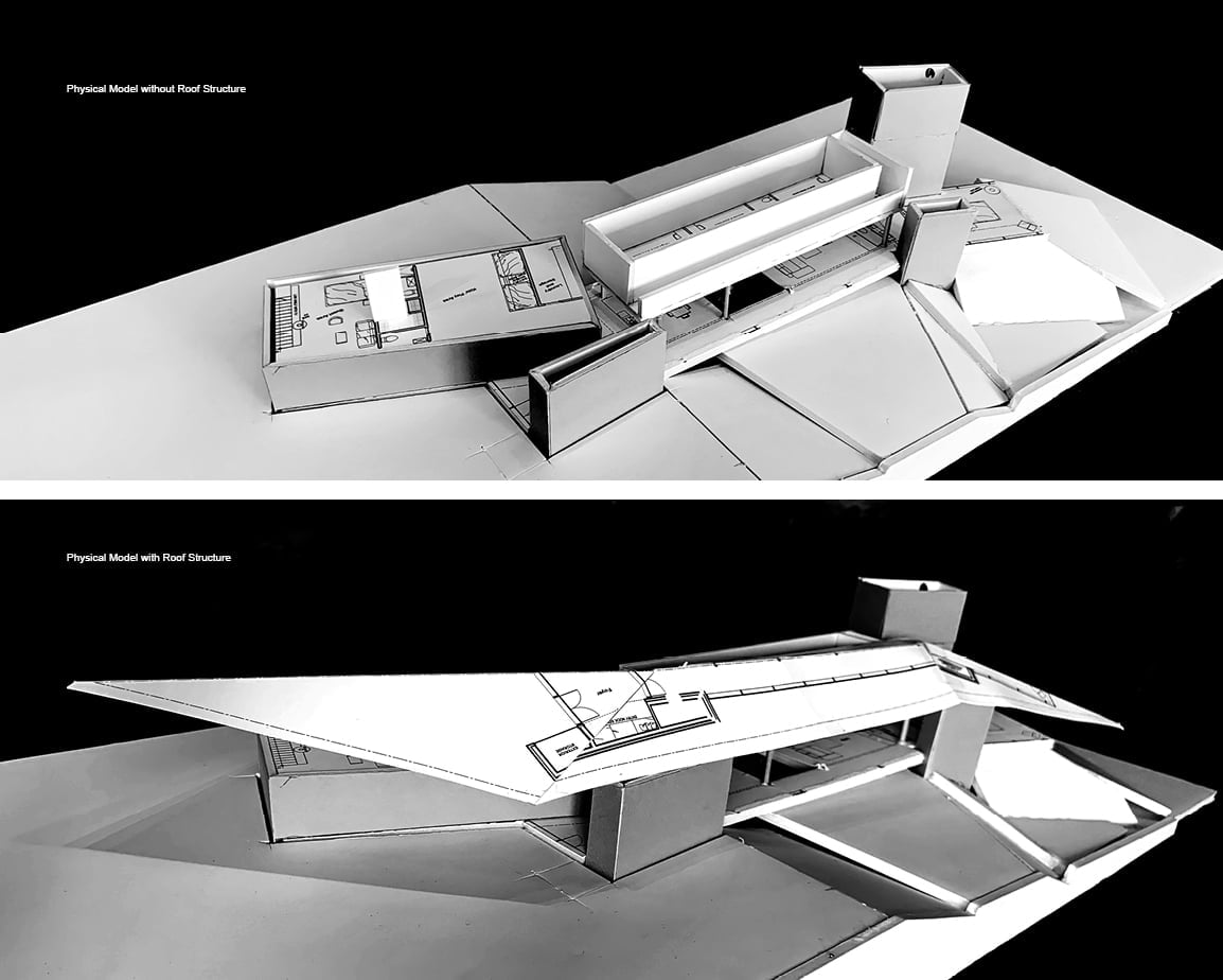
In terms of the structure’s design, we knew early on that we wanted to make the roof—despite its 60-metre length—seem light. We knew that in doing so, we’d be setting up a very difficult structural challenge for ourselves, but also that this kind of risk in a primary design move was the price of creating something spatially magical.
To that end, we decided against using heavy timber construction, which seemed too obvious a material choice for a forest getaway, and instead opted for steel, being careful to avoid the predictability of the sterile modernist box. The folds and angles of the steel roof evolved over numerous iterations using digital models. The roof’s steel gets thinner and thinner as it moves away from the central ridge beam.
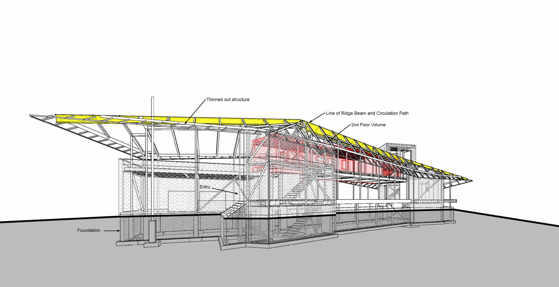
Slender steel columns support the roof’s frame, but we knew we didn’t want to leave things at that. So while all of the main family areas are below the meandering ridge beam and the bedrooms are bundled into a single volume, suspended like a cocoon above the main floor (represented in the pink-toned space in the digital model above), service elements like the garage, bathrooms, stairs, and pantry are grouped inside the opaque, solid-appearing portions of the home, which are clad in slate shingles. In this way, it appears that these volumes, a reference to the Canadian Shield rock that pokes out around the site, are holding up the light and graceful roof.
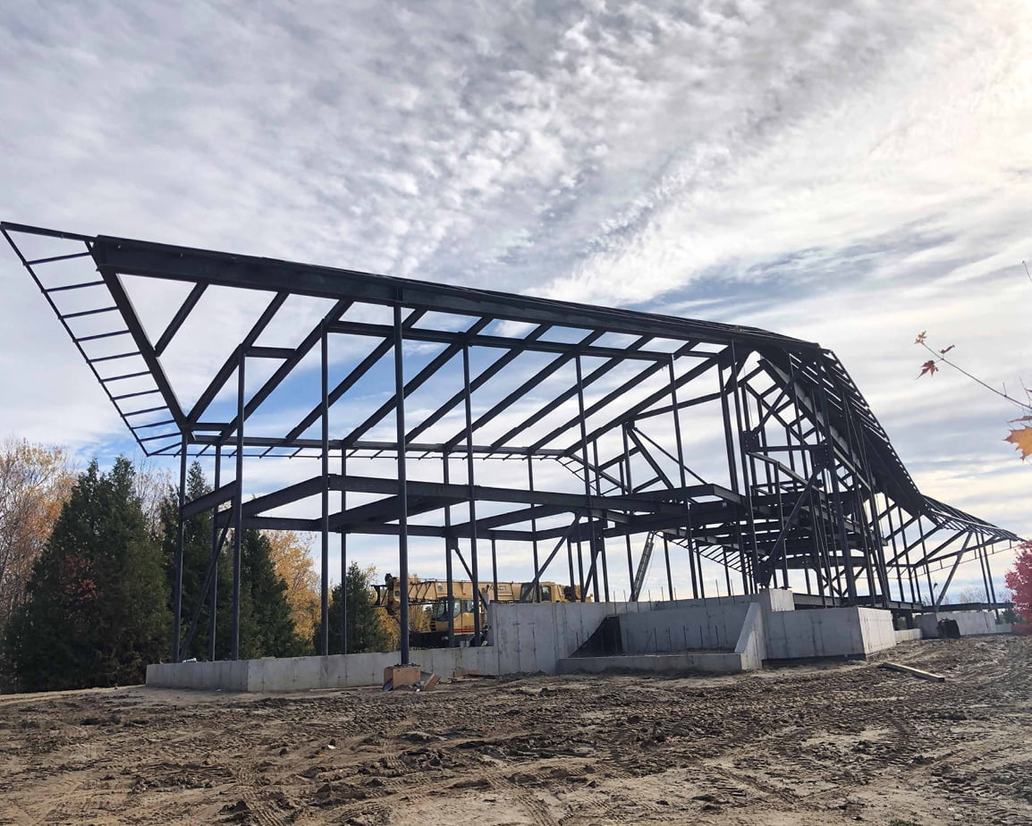
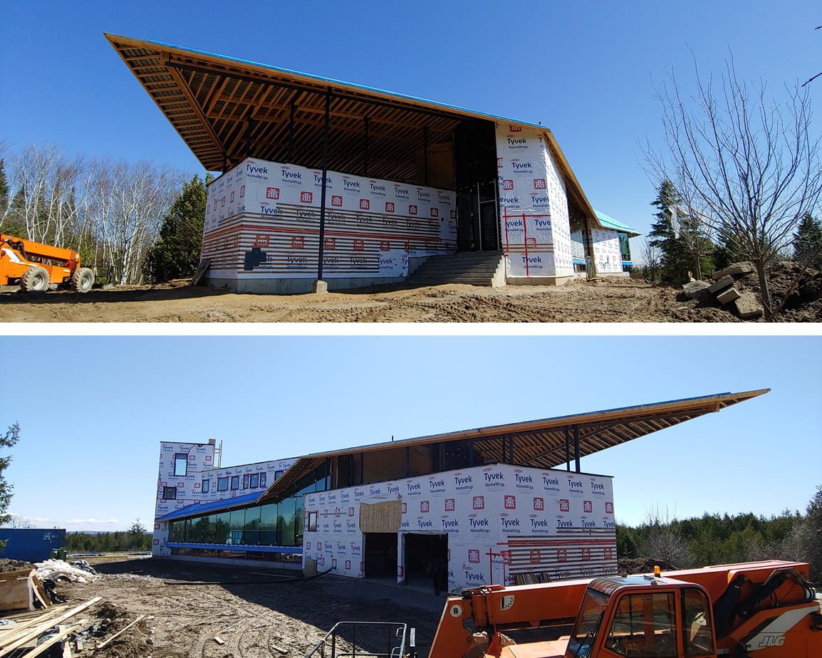
The site construction views shown indicate the play between the heavy, “grounded” volumes and the lightweight steel roof. At the entry side of the house, the roof narrows to a point and lifts like a bird’s wing off the garage volume beneath it, sheltering an outdoor terrace area that houses a fireplace and hot tub. The underside of the roof here and throughout the interior will be finished in oak.
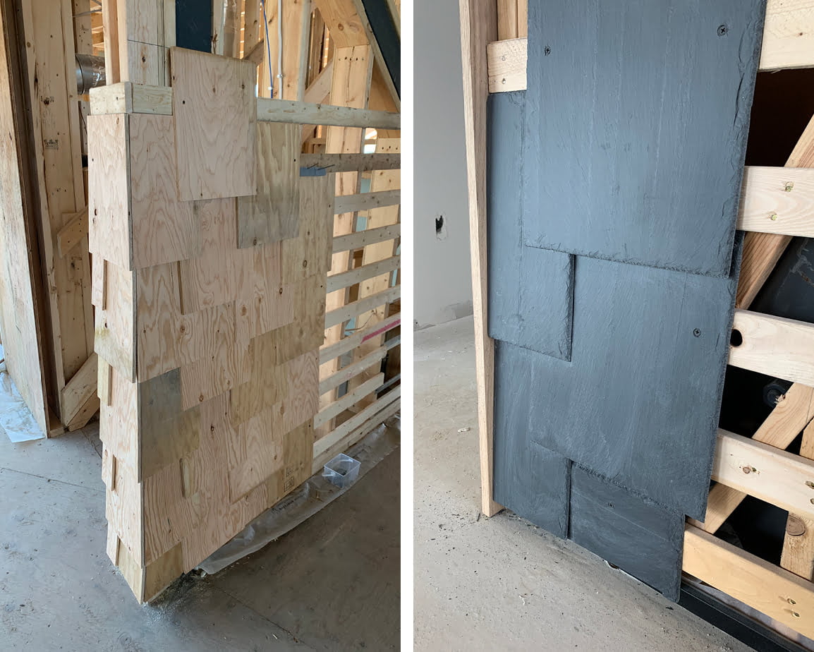
While our design studies evolve to a significant degree through a combination of physical models and digital renderings, we always work out certain key details on site at full scale directly with our clients. For example, we’d already decided to use grey slate shingles to cover a series of exterior and interior surfaces (after initially considering limestone and then a green slate), but we hadn’t yet designed the slate’s actual pattern and scale/size. We first used plywood to approximate the slate, since it could be easily reconfigured and trimmed, and when we and our clients felt things were starting to look right, we continued to refine the look using actual slate shingles.
The view from the home’s main entry spans across the living area with the catwalk to the kids’ rooms above following the path of the ridge beam. The living area looks toward the master bedroom suite at the very end of the main floor.
The home will have three large fireplaces, one in the main living area, one in the master bedroom, and one in the playroom.
The large opening in the floor visually connects the living and play areas. The steel structure will remain exposed, but the ceiling will be clad in smooth oak.
We’ve also joined forces with Vancouver designer Karin Bohn to develop the next level of material selections and furnishings. Take a site tour with Karin and architect Chris Davis, watch Part 1 and Part 2.
