Verval Conference Room
Project details
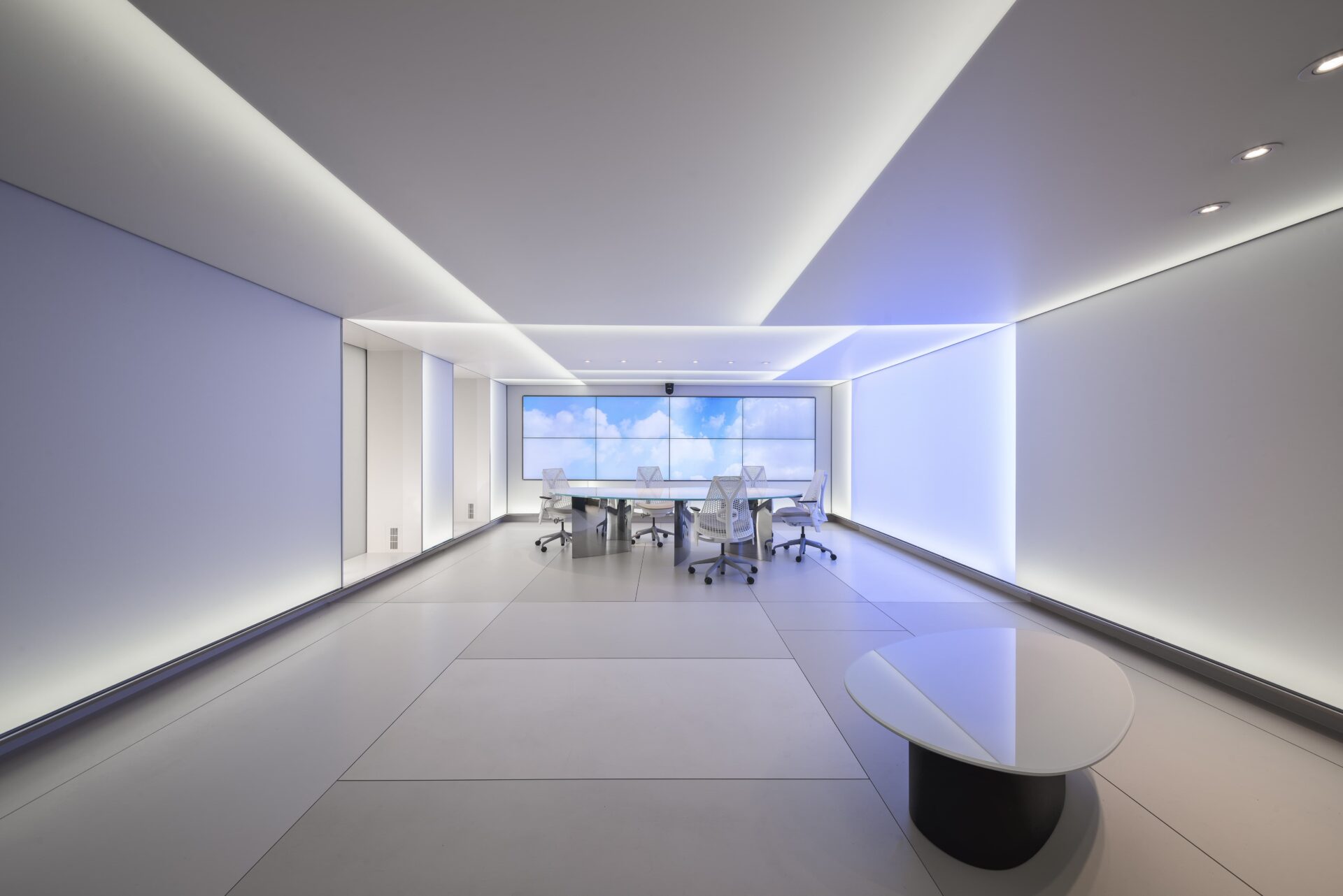
Verval is a maker of advanced glass wall systems. They asked us to create a high tech conference facility that would immediately communicate the precision and flexibility of their building envelope products. It was essential, however, that the solution be executed with extreme subtlety, so that visitors were left thinking, “Hmmm, how did they do that?”
An Expanse of Infinite Variety
Our design solution avoided the obvious use of glass. Instead, we considered the basic character of glass as a material: it maximises light while disappearing as much as possible, permitting the architectural space to become a continuum from inside to outside.
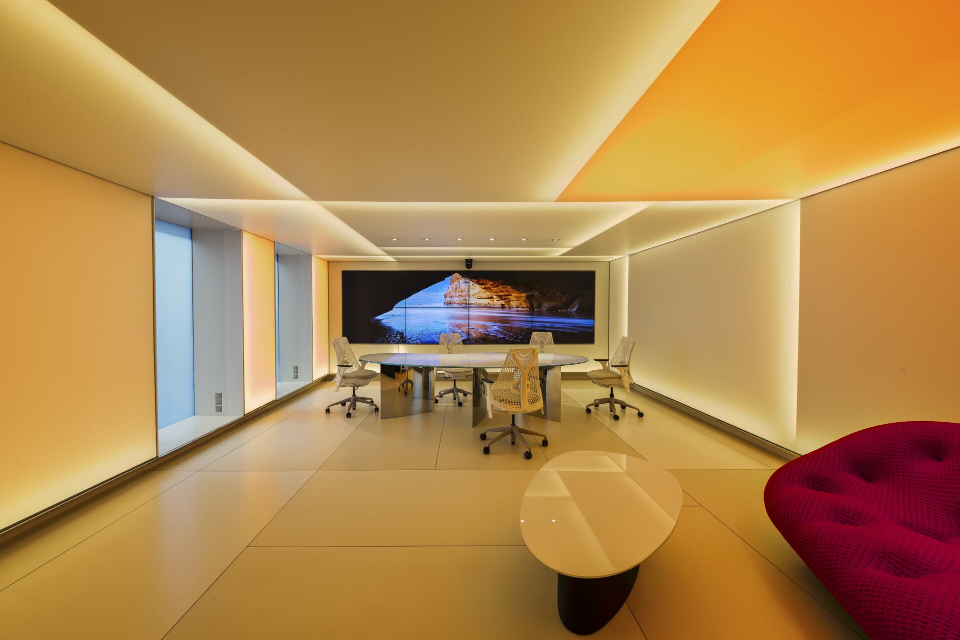
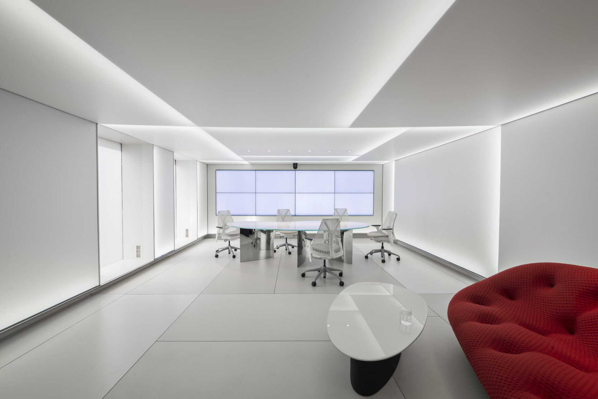
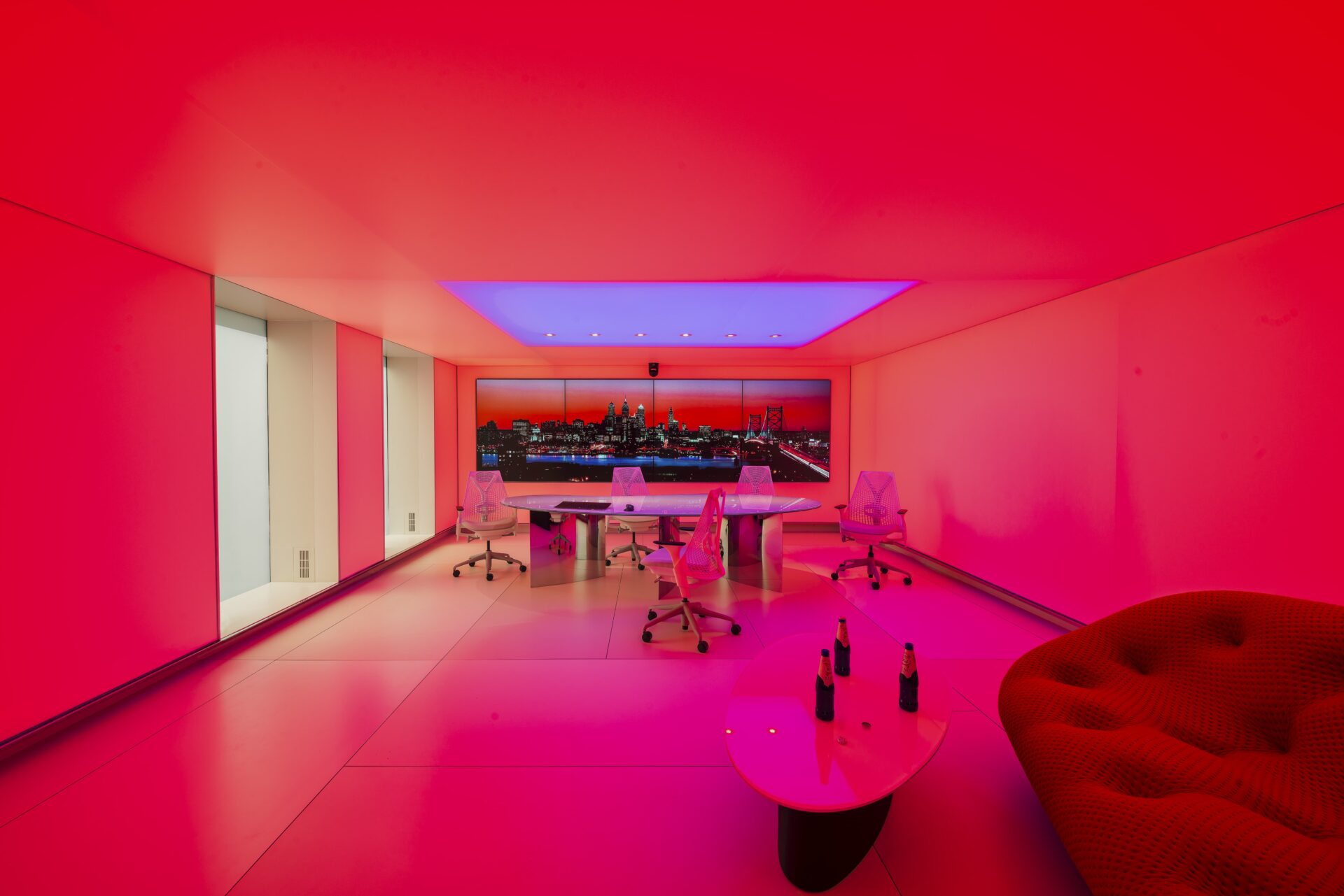
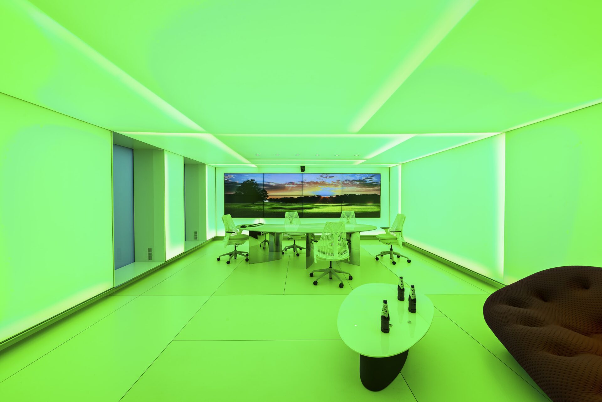
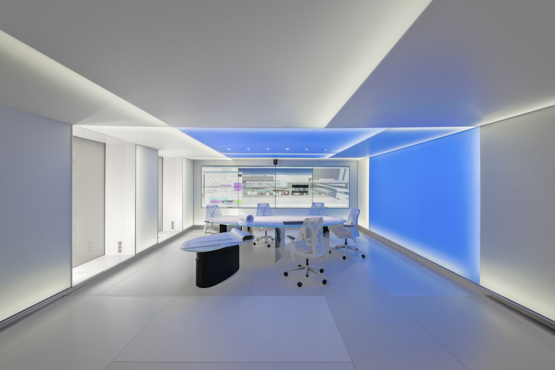
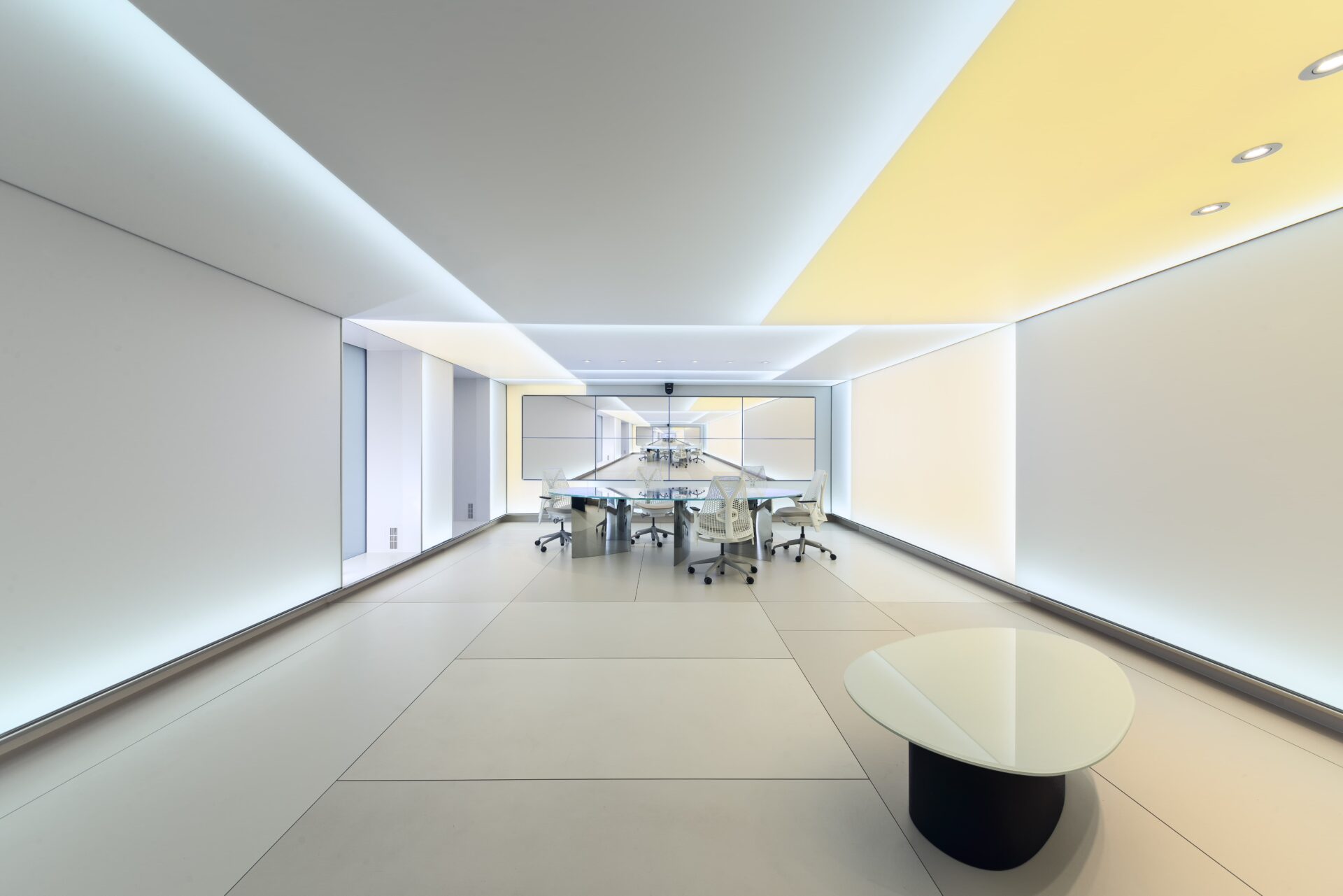
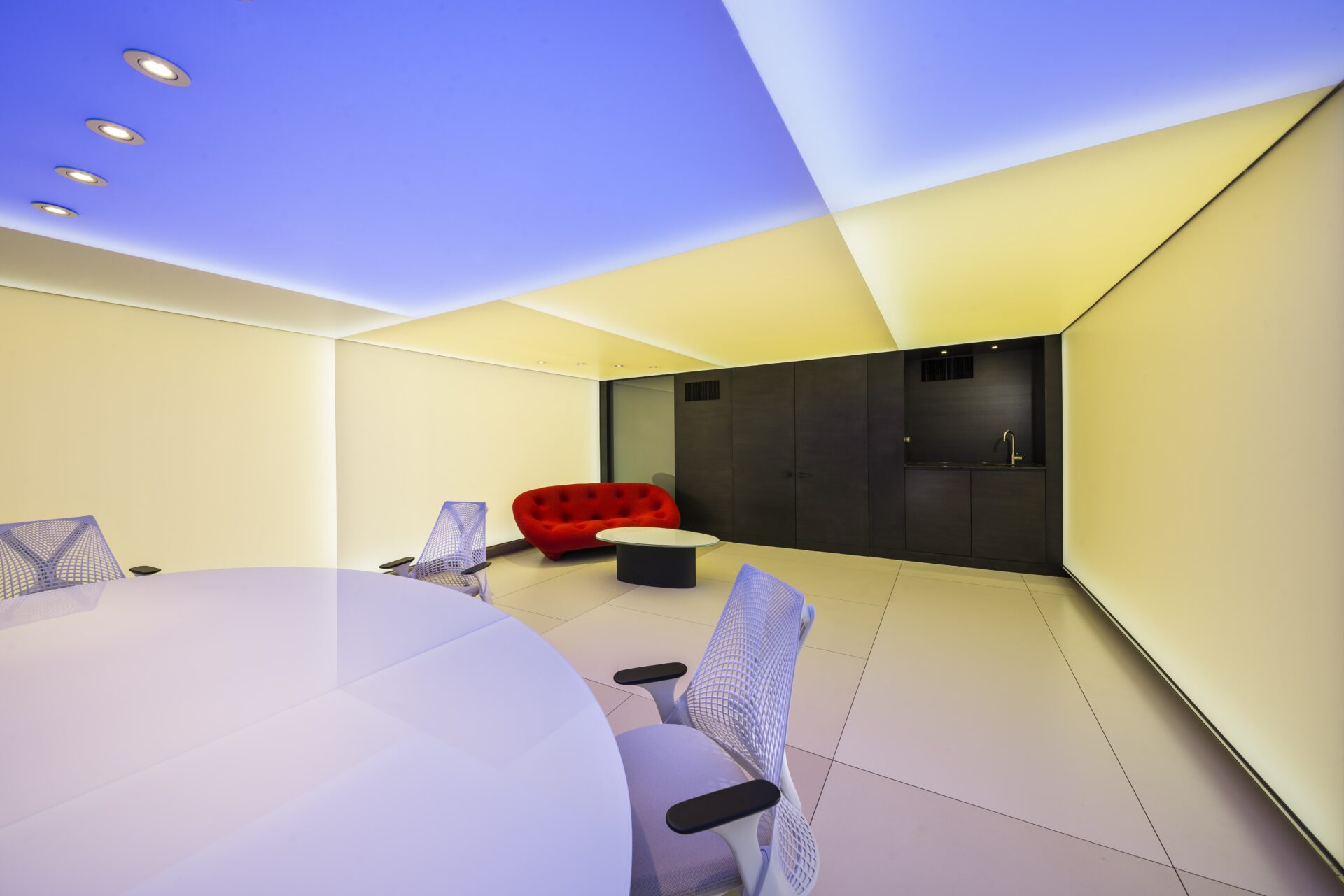
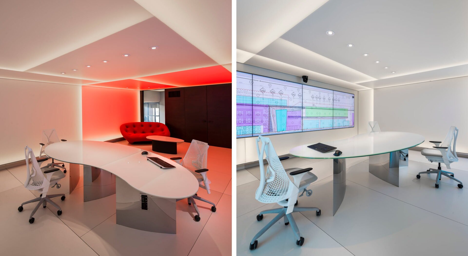
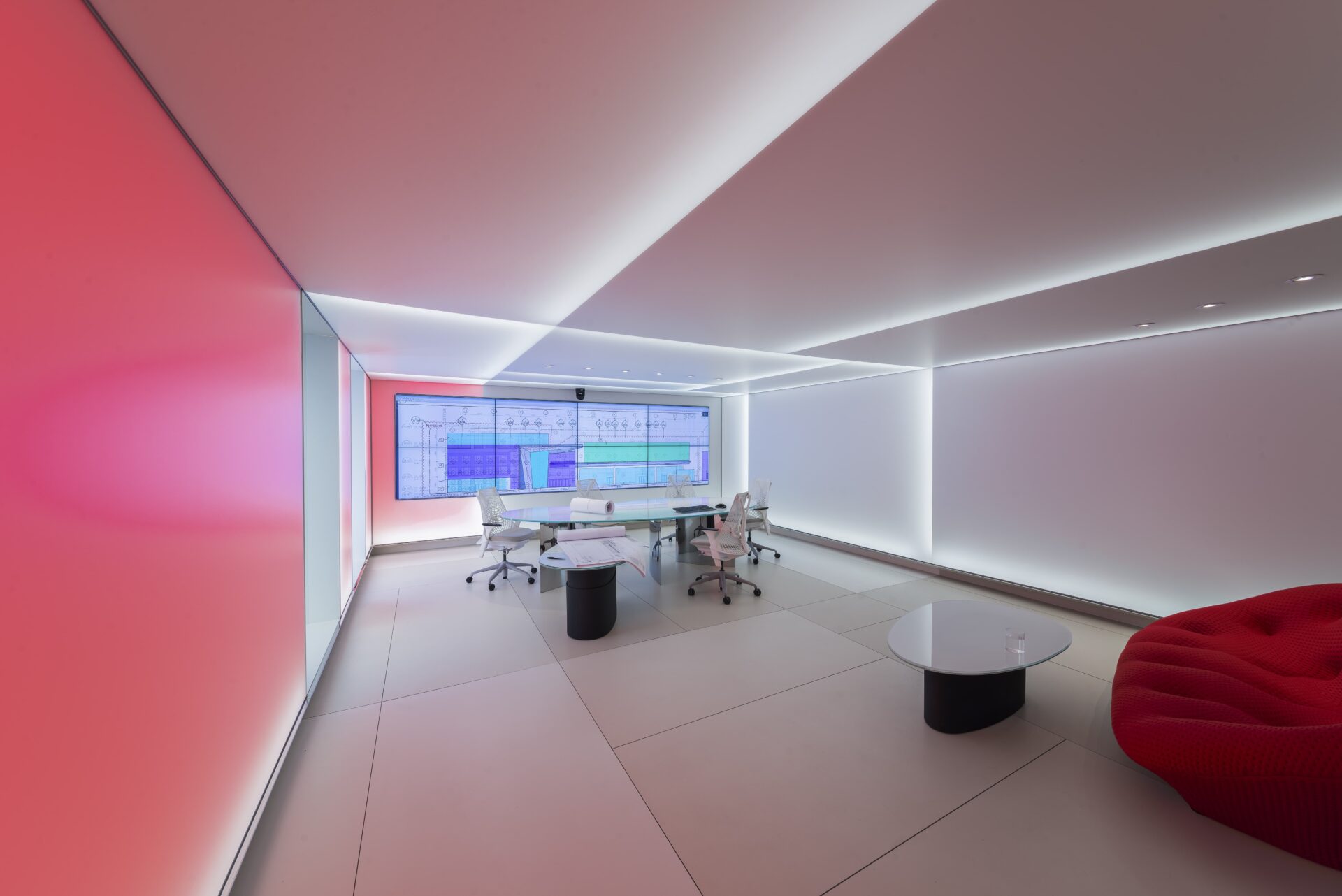
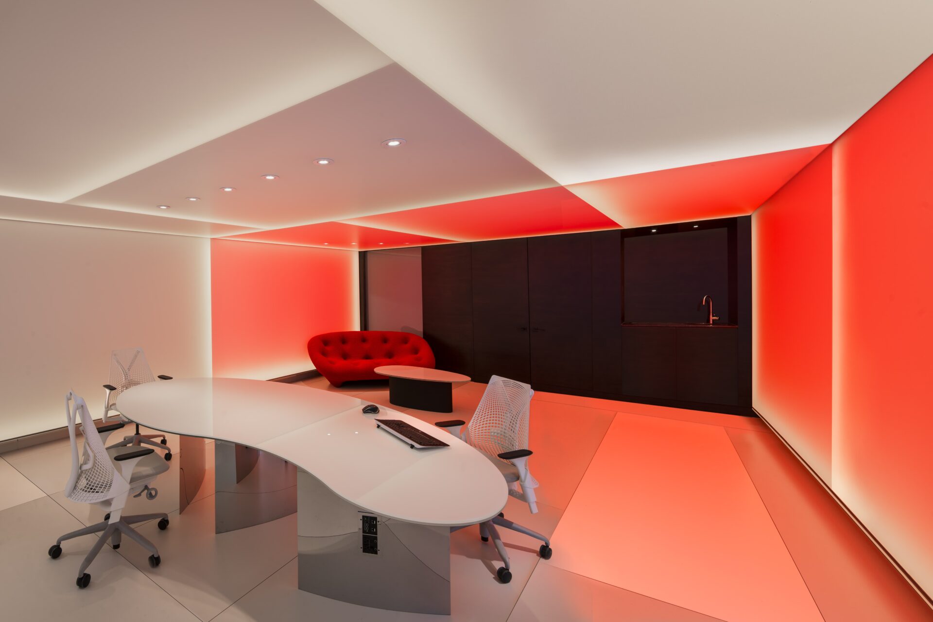
A system of infinitely variable LED lighting enables areas of different intensities and colours. Potential light scenes range from soft, natural daylight to elaborate, playful combinations. This range can be tailored to almost any situation, from long collaboration sessions to Friday afternoon social events.
While the technology used is complicated, the effect is one of simplicity: the walls and ceilings dematerialize, the original boundaries are made ambiguous, and the room appears to expand outwards into space as a continuum.
Empowering Teamwork
Because many of the company’s product design collaborators are in Europe, it was essential to have a large interactive screen that would enable easy work sessions. Eight screens occupy the majority of the wall that visitors see when entering the space. When these monitors aren’t in work mode, they can operate uniformly to create dynamic scenes whose colour and tonal values are “read” by the walls and ceilings.
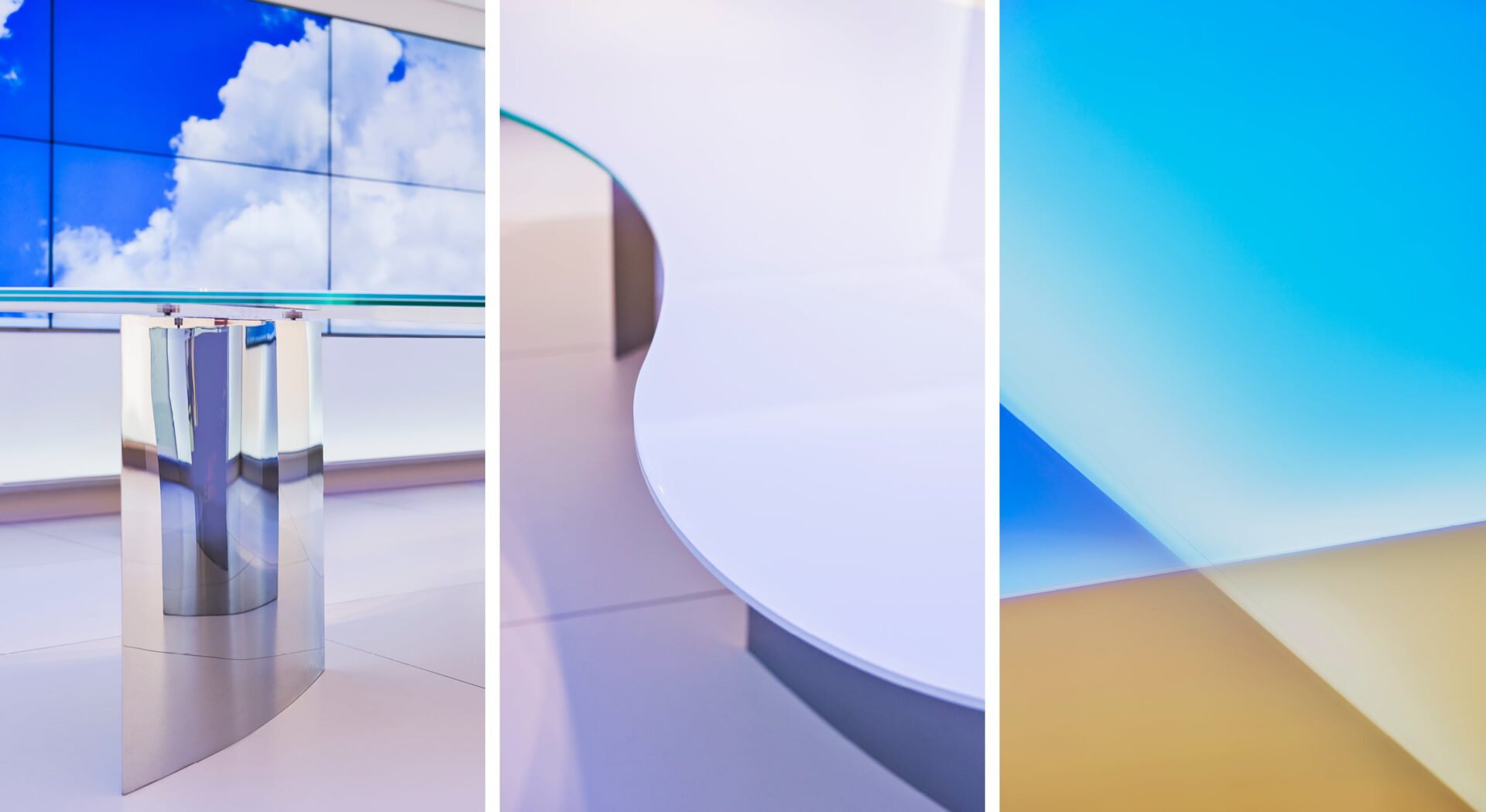
The large laminated-glass conference table was given a free-form shape to prevent hierarchical seating during long work sessions that require collaboration. Their exterior shells, formed as blade-like ellipses, dissolve with the light used at the time. Custom polished chrome legs were designed to serve as conduits for extensive wiring. A smaller free-form telescopic table serves as a side table and/or as a coffee table.
To avoid the impracticalities associated with a glass floor (like vulnerability to scratches, slipperiness, and visible hardware) we used ceramic sheets, each in a slightly different shade of white. These sheets reflect the light of the walls and ceilings with similar tonal variations.
The entry wall of the room is designed as a counterpoint to the rest of the space. Its doors and storage areas are panelled in a dark wood with visible graining but with no exposed frames.
The windows to the exterior and other parts of the greater office are fit with frameless switch glass. When daylight is preferred they remain off and when glare from daylight is a problem, they are switched on and their reflective white surfaces integrate into the surrounding lightscape.

